Texture Drawing Guide
Updated: 26 Jan 2026
For a drawing to be successful, you have to be accurate in both structure and brightness values.
You can learn about it here: how to draw realism.
To take your drawing to the next level, you need realistic textures.
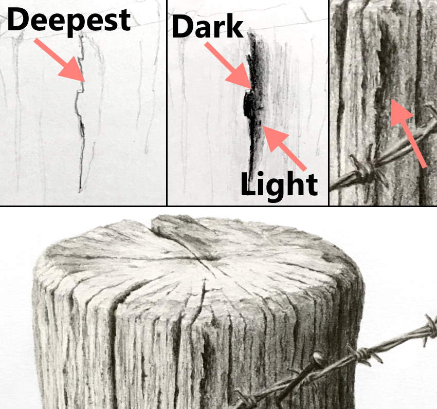
Holes & Cracks
We love them! They are part of the abstraction of nature and therefore attest to realism.
To draw ANY crack or hole, first decide where you want its deepest part.
The deepest part is the darkest.
Then, draw a transition from dark to light in the opposite direction.
Tip:
In many cases, the darkest part has a hard (sharp) edge due to overlapping.
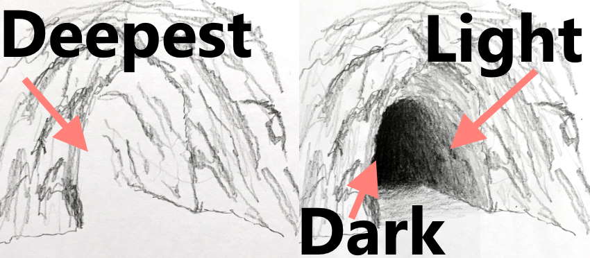
The same goes for any crack in any direction.
Ambient Occlusion
When an object is NOT facing the light source, it is still visible and clear.
The reason is ambient light. Meaning, scattered light and reflections.
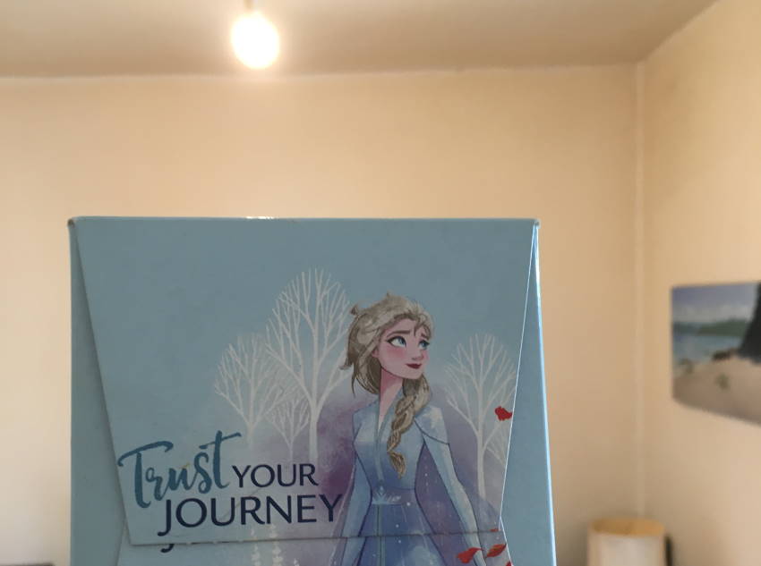
On the other hand, light cannot get into some areas.
The term for these areas is ambient occlusion.
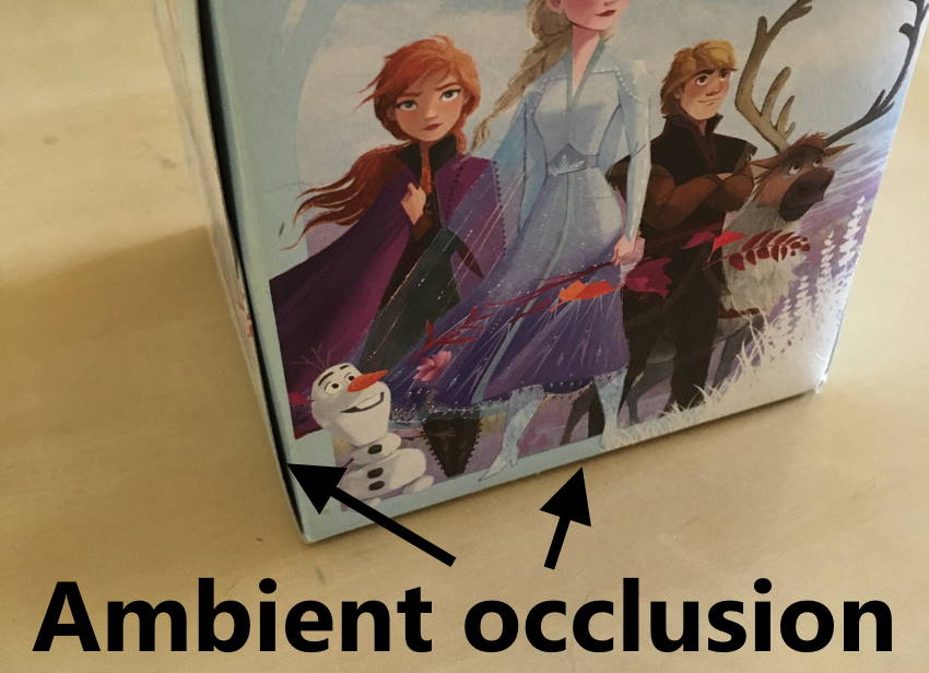
When drawing these areas (ambient occlusion), pay attention to edges. In many cases, they have soft edges, but in some cases, they have hard edges.
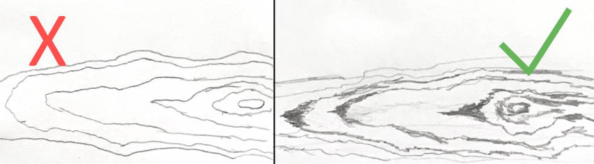
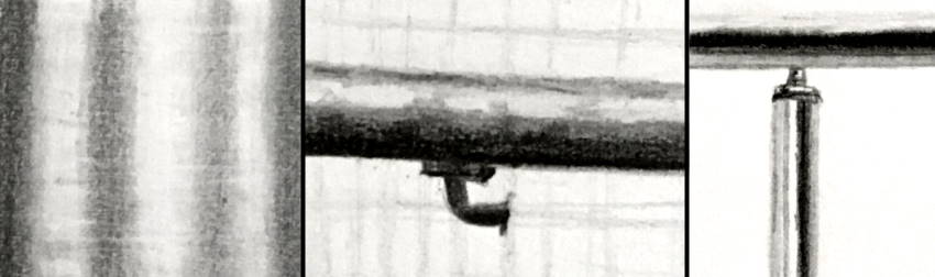
Cracks and holes are a type of ambient occlusion, though they are wider, and therefore there is a transition in brightness values.
In the next example, I overemphasized the parts between wood boards.
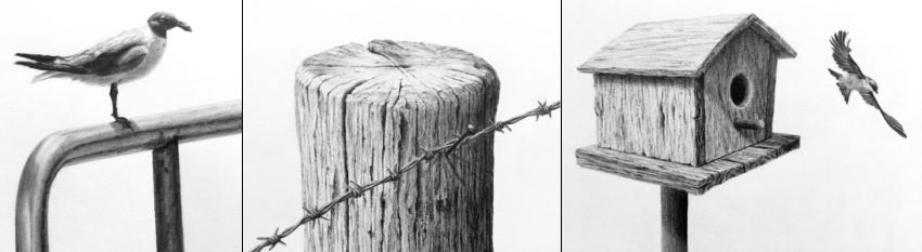
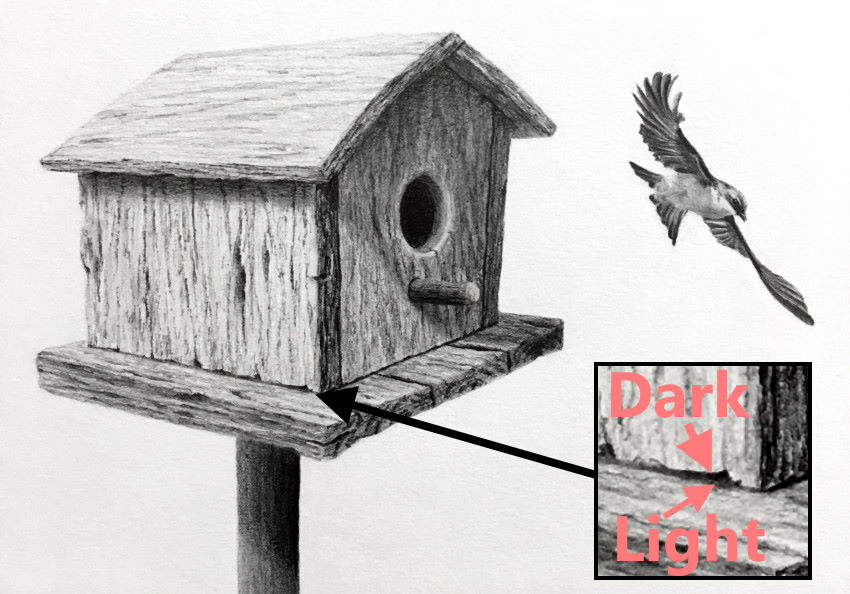 Birdhouse and a tree swallow bird
Keep in mind:
I drew the birdhouse from imagination, using linear perspective.
If you are new to perspective, visit my guide on linear perspective for beginners.
Wood Texture
The texture lines are NOT the problem. They are easy to draw!
Make sure the lines are not parallel.
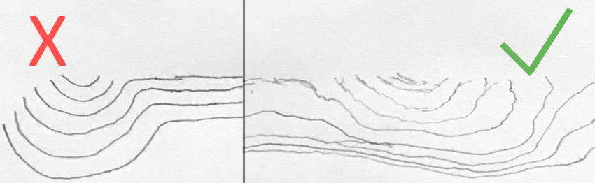
And that they are not of uniform thickness.
Pay attention:
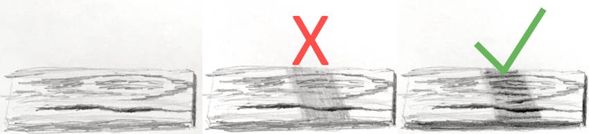
When drawing a shadow area, it is NOT enough to make that area darker.
Make sure both the texture and cracks are darker in that area.
For realistic wood texture, after drawing the texture lines, the structure should be accurate (in perspective), and the brightness values should be correct.
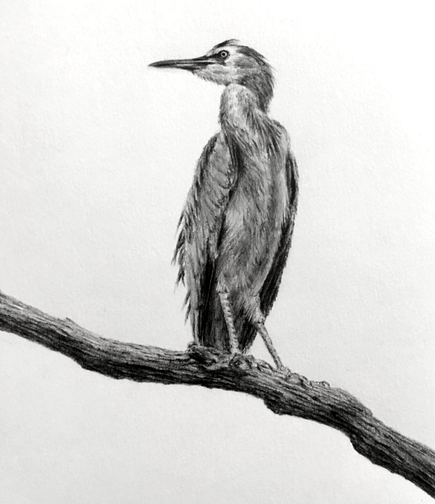
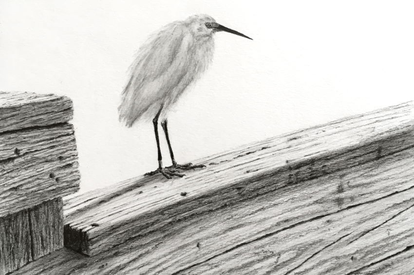 Snowy egret
Colors:
In most cases, use less saturated colors for realistic wood texture.
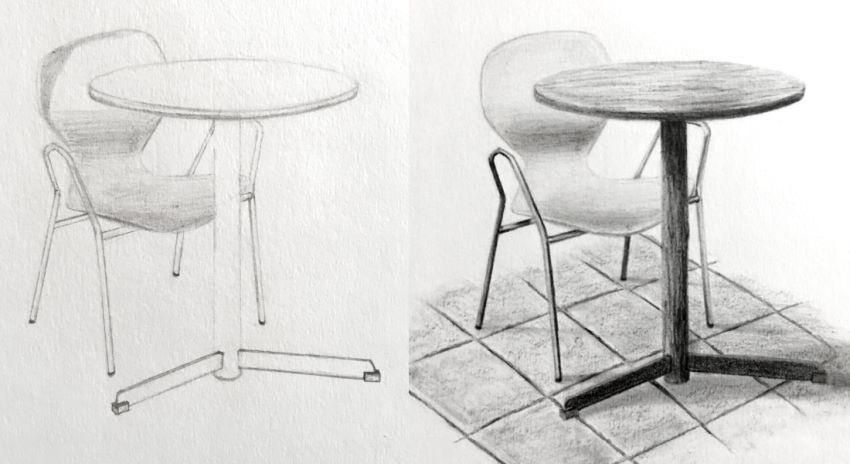
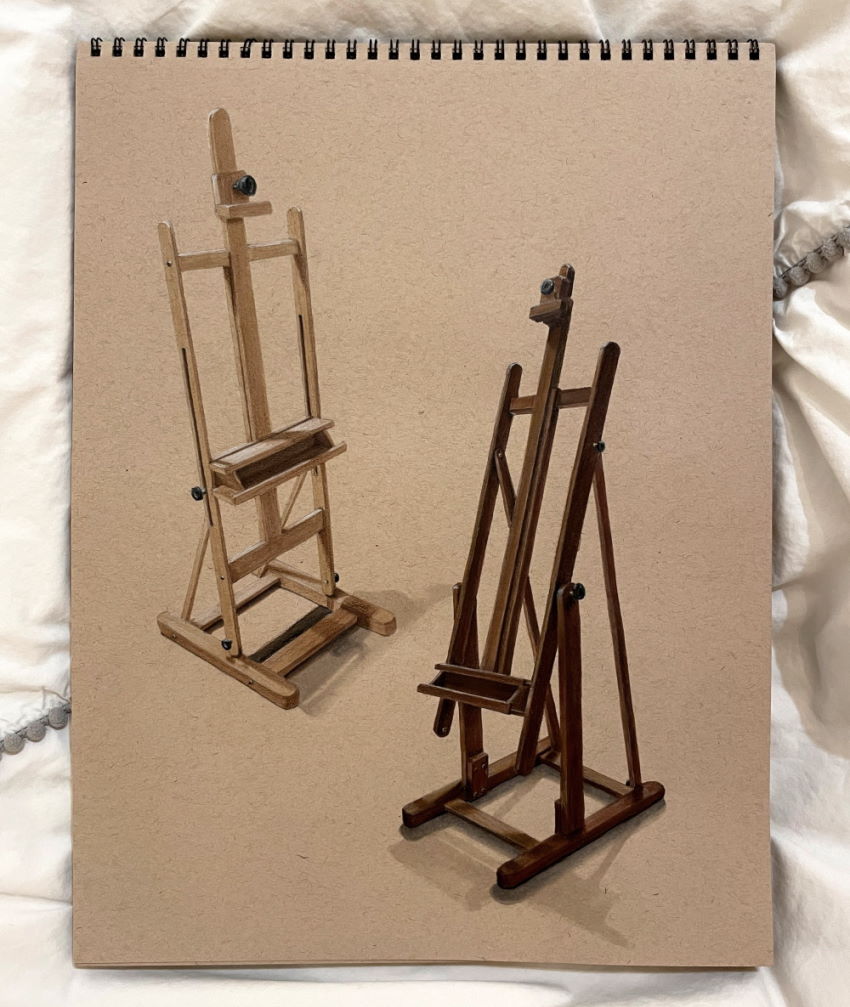 Easels drawing
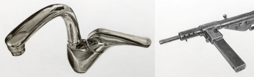
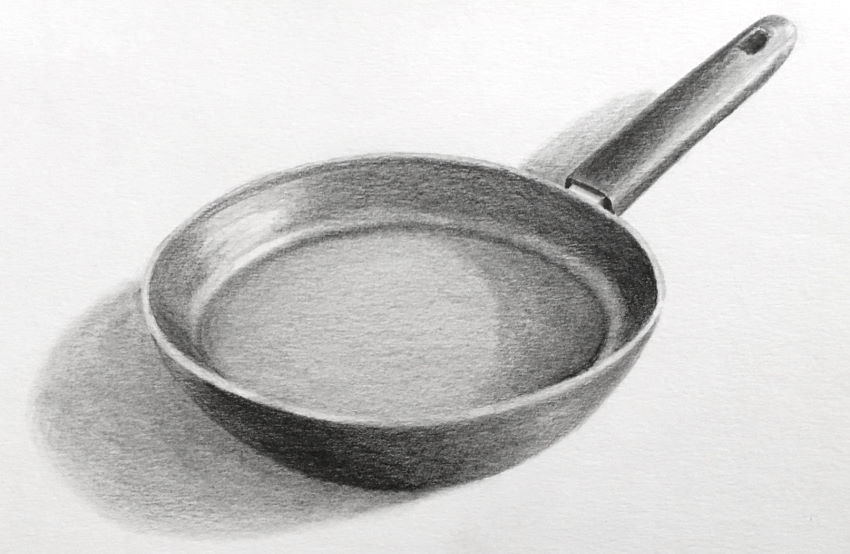
Metal Texture
The key to drawing metal objects is to be brave with contrast, depending on how shiny the metal is.
Meaning a significant difference between dark and light brightness values.
Note:
When drawing light and dark areas, connect them with less defined (or soft) edges.
You can use smoothing tools, like a synthetic brush or a blending stump, to soften edges.
Too little contrast results in a flat drawing, while too much looks cartoonish.
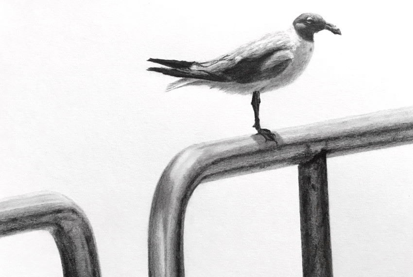 A laughing gull on a metal fence
Here you can find more on how to draw complex objects.
Remember:
While solid objects (like metal) have hard edges, cast shadows have soft edges.
Good to know:
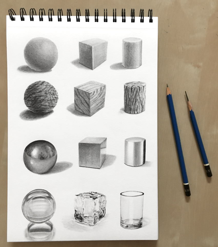
Many examples in this guide involve round objects, which are quite complex to draw.
These are usually foreshortened circles (ellipses) and cylinders.
To learn how to draw these shapes, you might want to check out my round object drawing guide.
Colors:
For any drawing or painting medium, contrast (in values) is the key to shiny metals.
In the example below, I drew the base layer with markers; it still has no contrast.

For strong contrast, I drew the light and dark areas with colored pencils.

When using colors, reduce the amount of saturation. Meaning, use dull and grayish colors (not rich and vivid colors).
In the next example, I used markers and colored pencils. Toned paper helps reduce saturation.

For more on markers, visit my recommended markers review.
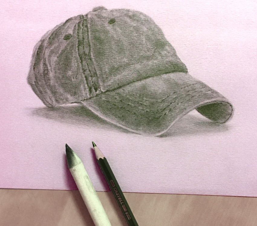
Plastic Texture
Plastic, usually, does not have texture. It is quite smooth.
Additionally, it does not have strong highlights or strong contrast, except for special cases.
In the example below, I drew some small stains for texture.
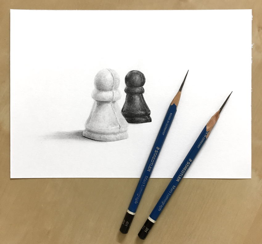 Black & white chess pawns
When it comes to plastic, which has a smooth surface, I use extra smooth paper (Bristol).
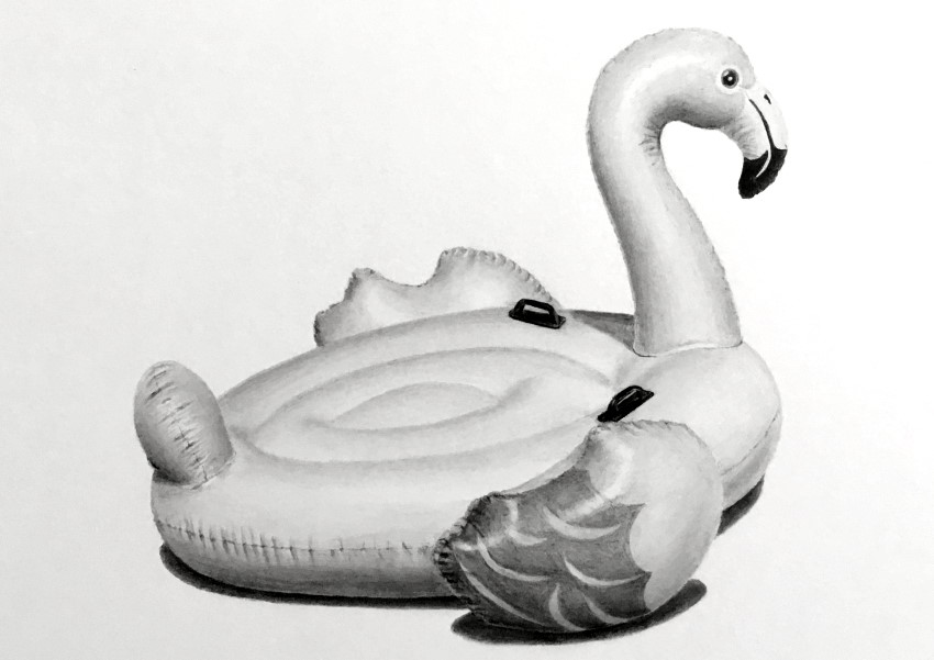 Inflatable flamingo
Remember, for plastic, use fewer texture marks and less contrast.
To learn about different paper sheets I use for different textures, visit my guide on recommended paper for drawing.
Composition Tip
Objects by themselves are quite boring.
By using the power of overlapping, meaning an object that covers part of another object, you can add a sense of depth to your drawing.
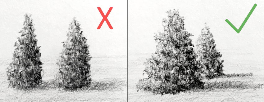
When the structure for your drawing is ready, and it has a nice composition, it is time for texture drawing.
You can mix as many textures as you like.
Another type of composition I like to draw is a collection of drawings that tells a story.
Textures will enrich any composition.
Here you can learn more about composition drawing for beginners.
Organic Texture
For organic textures, like leaves or flowers, visit my guide for drawing flowers.
Tree trunks are not that hard to draw.
Most important are the shape and values. The texture marks get darker in the shadow areas.
Check out my tree-drawing guide for more details.
 White-faced heron
Fabric Texture
In some cases, I use the paper tooth for drawing texture.
It is great for fabric.
Pay attention to brightness values, meaning the darker and lighter parts of each fold.
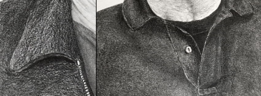
Fabric is soft and therefore has soft edges within its surface.
You can use a smoothing tool, like a blending stump, to smooth the edges.
A blending stump is great for fast results. For more accuracy, smooth with your pencil while drawing.
 Blending stump for smoothing
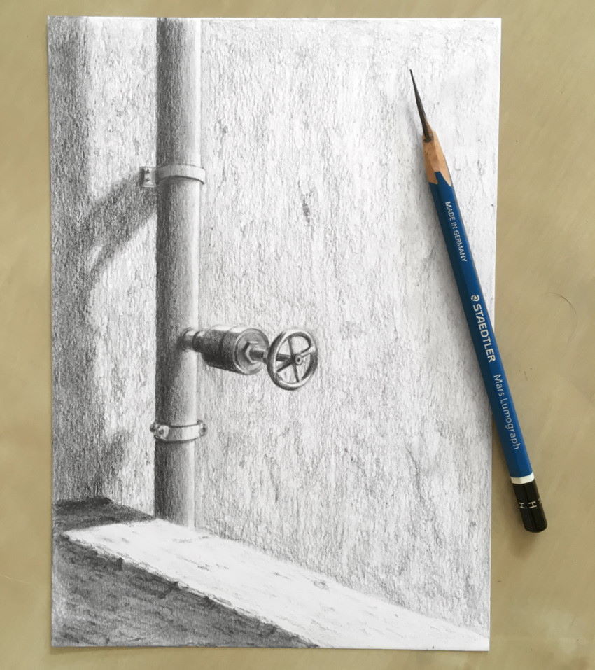
Wall Texture
For wall texture, I often use a pencil with a sharp angle, almost parallel to the drawing surface. Meaning, horizontal.
I let the tooth of the paper do the rest.
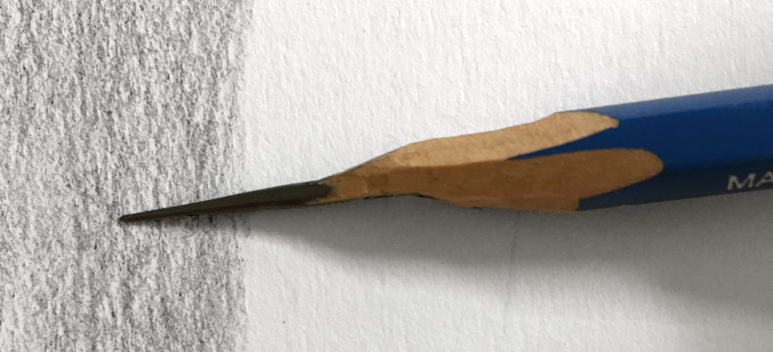
In this method, only the top part of the paper grabs the graphite particles, so there is importance to which paper type you use.
Different pencil brands or pencil grades produce different results too.
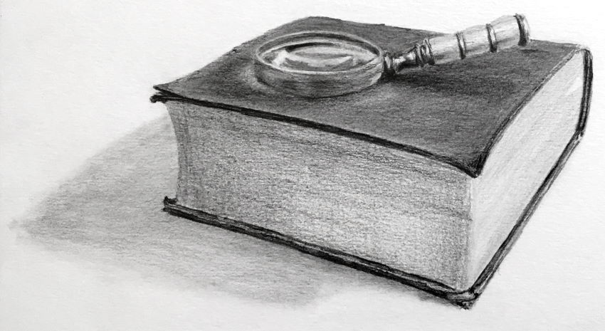
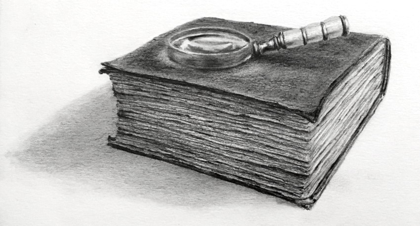
Book Texture
Important:
Texture (or color) is the least important factor when drawing.
If the structure is not correct or the brightness values are off, texture is useless.
Pay attention to perspective and foreshortening.
In the example below, the top part of the book, which should be wider than the side, is foreshortened.
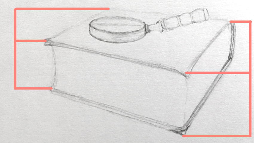
After the form is in perspective, focus on brightness values.
The drawing is ready now. To take it to the next level, add texture.
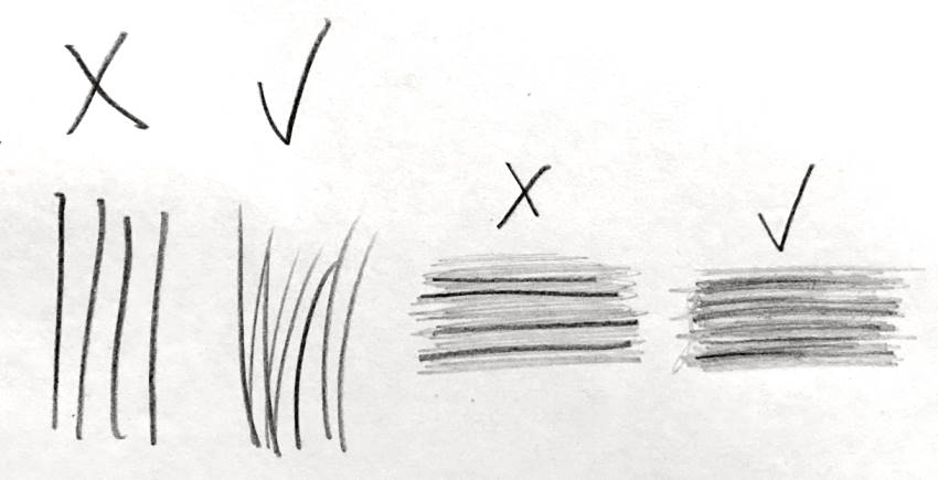
When drawing the texture, do not use straight lines. Instead, use tapered lines.
Meaning, lifting the pencil while drawing so the lines get lighter and narrower gradually.
You can draw the book from observation (photos), direct observation (from life), or from imagination (knowledge in perspective).
For the texture, though, there is no need for reference. With practice, and some more practice, you can add as many details as you want, from imagination.
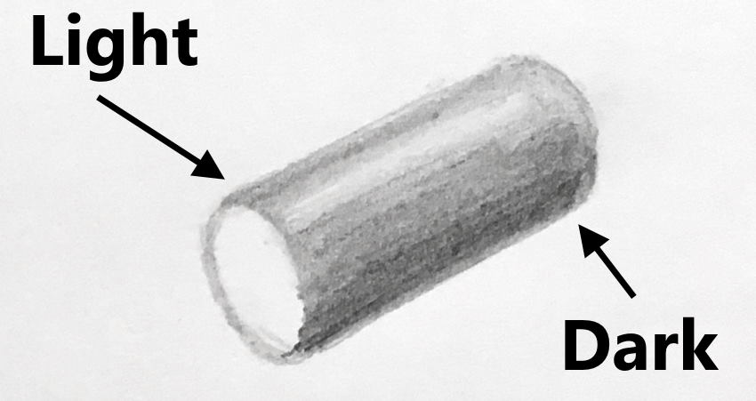
Core Shadow
When light hits an object in space, the object has a light side and a dark side.
A rounded object, like a cylinder, has a gradual transition from light to dark.
The darkest side is opposite to the light source.
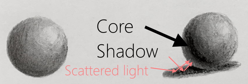
When an object is on a plane (like on the ground, table, etc.), or close to a plane, it receives reflected light from that plane.
In these cases, the darkest area gets lighter due to scattered light from the surface.
Therefore, the darkest area is now near what used to be the darkest area, and it is called the core shadow.
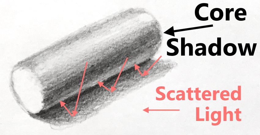
The same goes for a sphere and other shapes.
To learn how to draw a ball, visit my ball drawing guide.
Keep in mind:
While the core shadow is the darkest area on the object surface, it is not the darkest area in your drawing.
In many cases, ambient occlusion is darker than the core shadow.
Not all surfaces and objects reflect light or absorb light.
It is a good practice to observe how different textures behave with different light sources.
Practice drawing the basic shapes with different textures and light sources.
Summary
Now that you know how to draw some textures, it is time to put it to the test.
Visit my guide on drawing from imagination to create your own artworks, and enrich them with textures.
To be a successful artist, you need both knowledge and brush mileage (practice, practice, practice).
Here are 15 methods on how to draw depth.
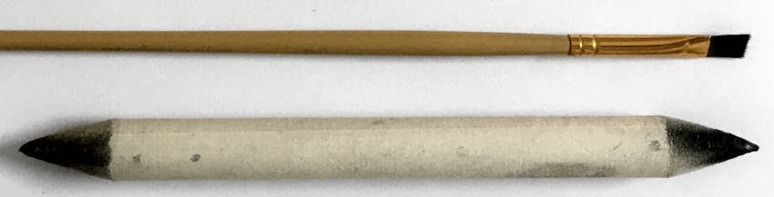
To learn more about the equipment I use, check out my drawing materials guide.
Important:
Drawing (or painting) is problem solving. While there are textures that you encounter time and time again (like fabric, metal, wood, etc.), there are textures that you encounter for the first time.
Use your knowledge and experience to draw new textures.