Tree Drawing Guide
Updated: 04 Jan 2026

In this guide, I will demonstrate how I simplify the drawing process, and I hope that by the end of it you will be able to draw your favorite tree.
In order to draw realistic trees with pen and ink, it is important to pay attention to the accuracy of the form (structure) and to learn how to draw the illusion of brightness values and transitions with pens.
Bamboo
When looking at ANY tree, examine its basic shapes.
It is a good practice to draw its simple shapes first.
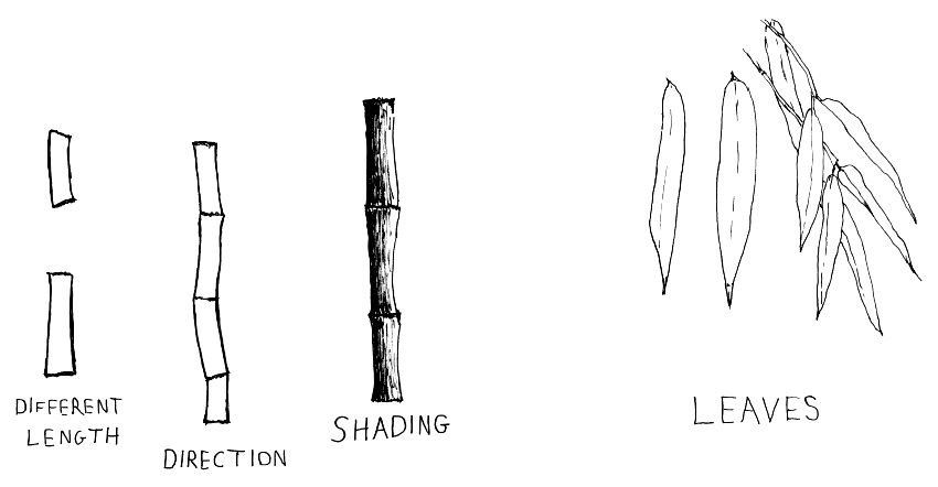
Once you understand these simple shapes, you can use your artistic license and your knowledge to recreate it.
There is no point drawing every single leaf as you see it (when using a reference image as a guide).
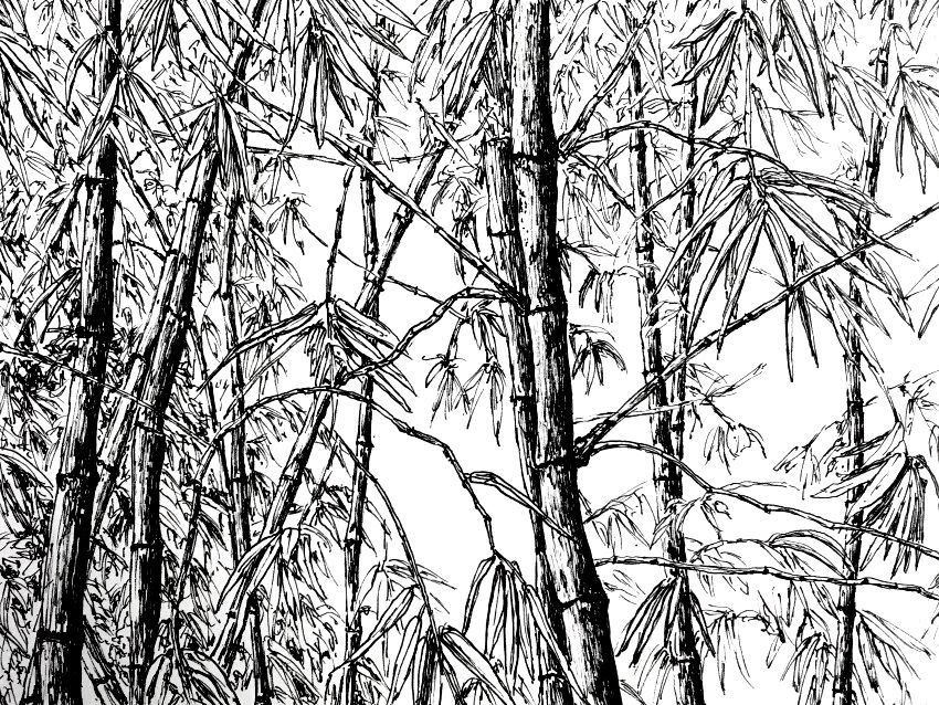 Bamboo
Banana Tree
For trees with big leaves, like a banana tree, first draw a study of the leaves from different angles.
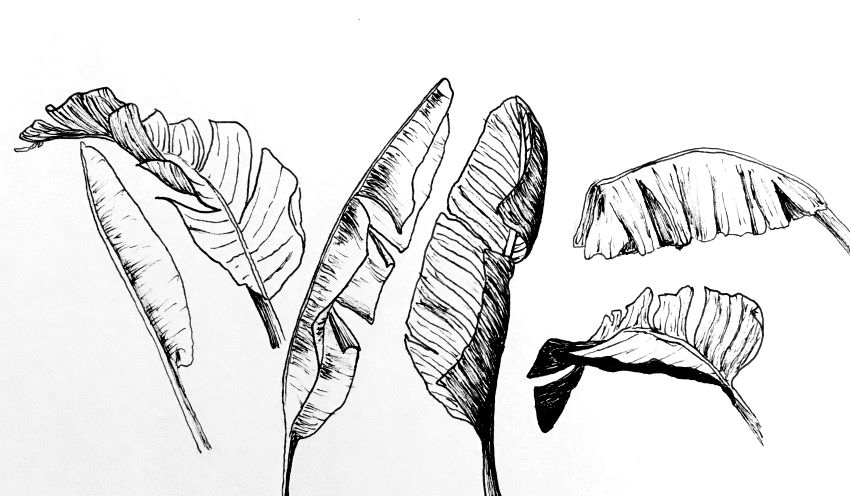
For a realistic result, make sure there is no symmetry and that each leaf is unique.
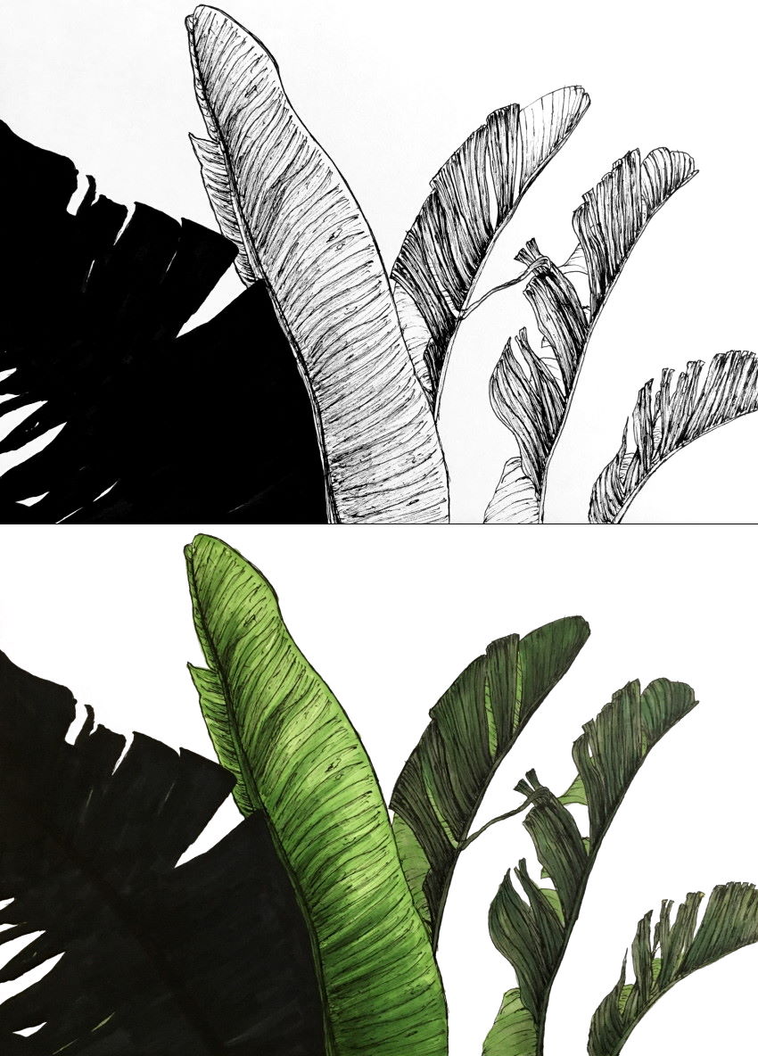
You can use markers; they work well with pens.
Olive Tree Trunk
Look at some reference images, or actual trees, before drawing the tree trunk.
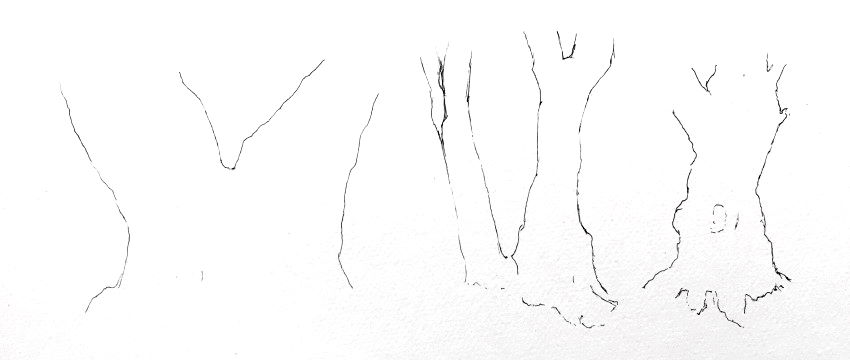
First, draw outlines to create the form (structure).
Remember:
Draw thin and gentle outlines so they are not bold.
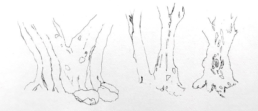
Next, add some guidelines and basic details.
The last step is texture drawing.
Focus mainly on brightness values while drawing marks with shape and direction like the reference image.
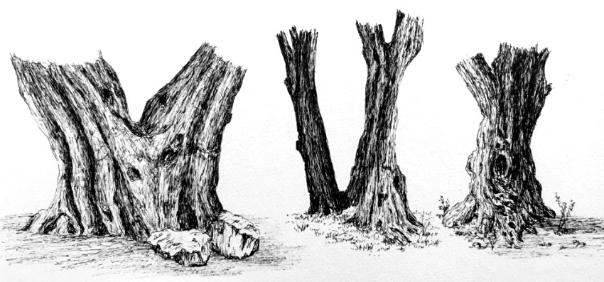 Olive tree trunks
Keep in mind:
Each olive tree trunk has its own "personality," but all olive trees share common basic shapes.
Tree Trunk Structure
Tree trunks are like cylinders.
Avoid drawing a tree trunk with a flat bottom (unless it is on the horizon).
The amount of foreshortening is determined by how low or high the horizon is.
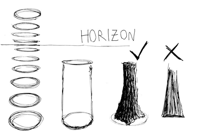
The higher the horizon is, the more rounded (less foreshortened) the base of the trunk is, and vice versa.
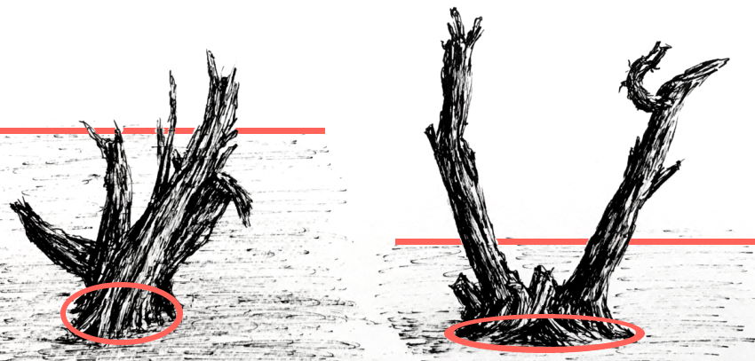
In many cases, the bottom part of the trunk is thicker.
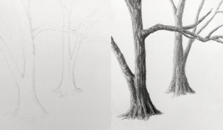
Tree Bark
For some tree barks, I pay attention to the overall transition in brightness values.
Others are made of many bulging pieces, of which every one is a rectangle-like shape, though they vary in shape slightly.
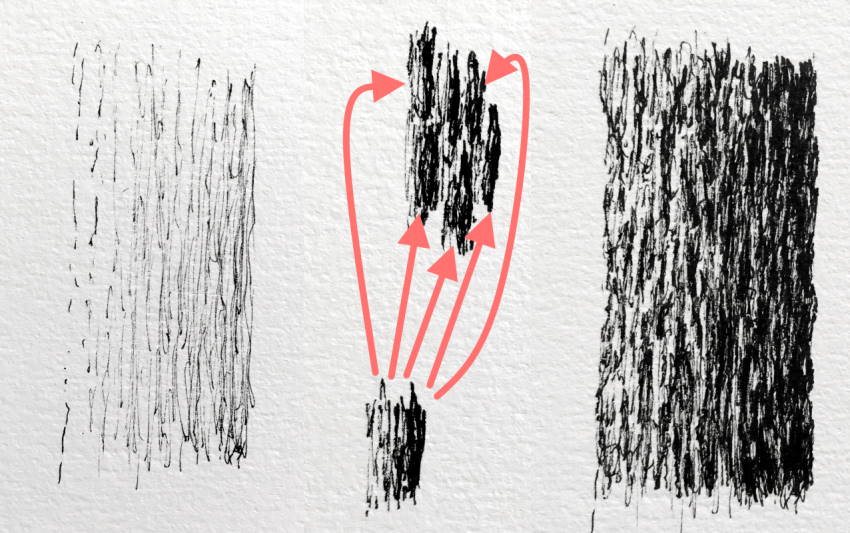
The same works with pencils.
I always add abstraction to the shapes, making sure they are NOT uniform.
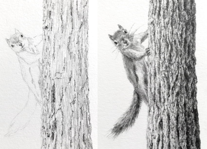
How to Draw Leaves
Drawing leaves can be challenging. Understanding their structure and breaking the drawing process into steps produces a satisfying and realistic result.
Each tree leaf is in a different direction, has a different degree of foreshortening, and is overlapping other leaves.
Simply put, the form and texture of leaves are abstract and messy.
To draw that, you need to be sketchy and loose with your marks, and to avoid any pattern!
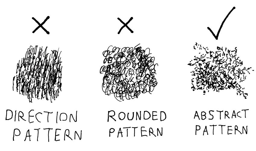
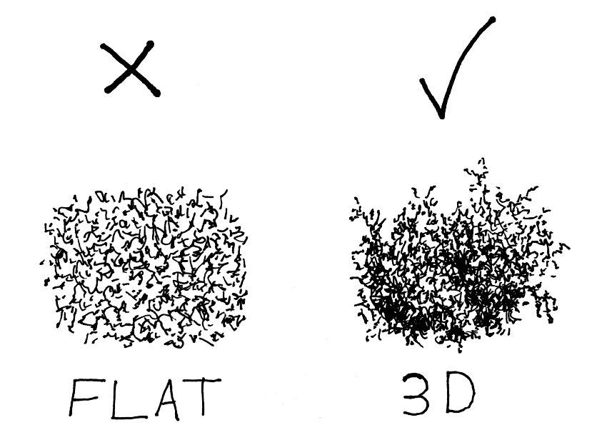
The next step is to pay attention to brightness values. That is how you create the illusion of volume. Meaning, three-dimensional and not flat.
To create that illusion, scribble more lines for darker values and fewer lines for brighter values.
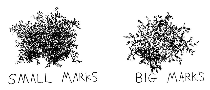
In addition, pay attention to leaf size, depending on the tree type and how distant it is from the observer.
For big leaves, sketch big marks, and vice versa.
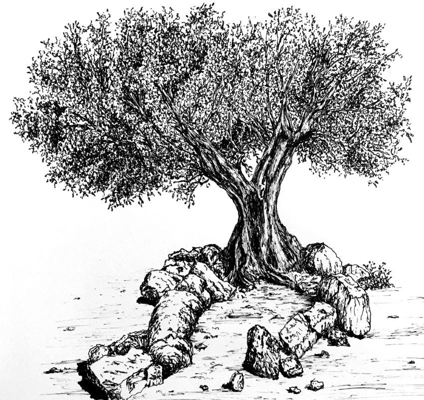
While the treetop is messy, at its edges you can add some indication of leaf type and size.
 Olive tree
After understanding the characteristics of a specific tree (olive tree in this case), it is quite easy to draw it from imagination.
If some terms like foreshortening and overlapping are new to you, read my guide on how to draw with a sense of depth. It covers 15 methods to add depth to your drawing or painting.
Good to know:
Mostly, I use a pen with a nib size of 0.1. It is small enough to create fine details.
Photos & Contrast
When I am taking photos of a tree, I do it from several angles.
If possible, I circle the tree to get a photo from every angle.
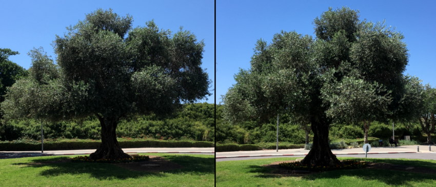
I select a photo that has high contrast as my reference image.
Contrast between highlights and shadows is crucial for a drawing to stand out and to have presence.
Not enough contrast leads to a flat drawing with no depth. Too much contrast looks cartoonish.
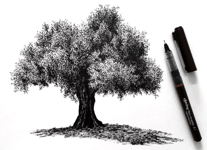 Olive tree
It is important to use clear and high-quality photos.
The next example is of an olive tree at night, which shows fewer details.
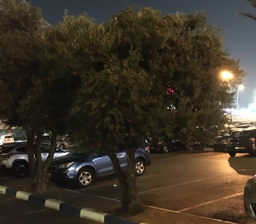
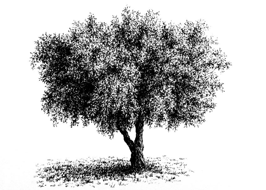
With practice, you will be able to produce a drawing from a bad photo, though it is not recommended.
Pine Trees
Important:
Before diving into complex texturing and rendering, if you are a beginner, you might want to practice the next step.
Draw any random tree shape, sketch some random marks to fill it up, and then draw more sketchy marks in one side and at the bottom of the tree (to create a darker value for the shadow area).
This should not take more than 5 minutes! The advanced texture you will see after this example is just a matter of many hours of practice to refine the texture marks.
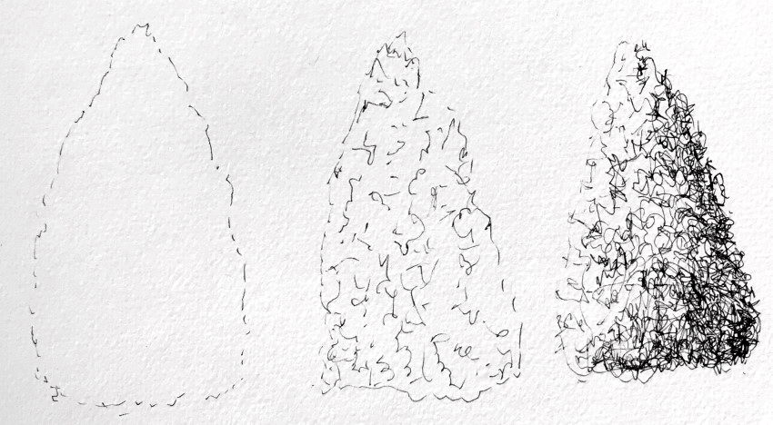
Pine trees are relatively easy to draw from imagination.
They have very small, needle-like leaves.
I like to start by gently drawing the form and then fill it with small, random marks that are NOT in any specific direction or with reoccurring shape.
The last step is to draw more marks for darker areas, depending on the direction of light you choose.
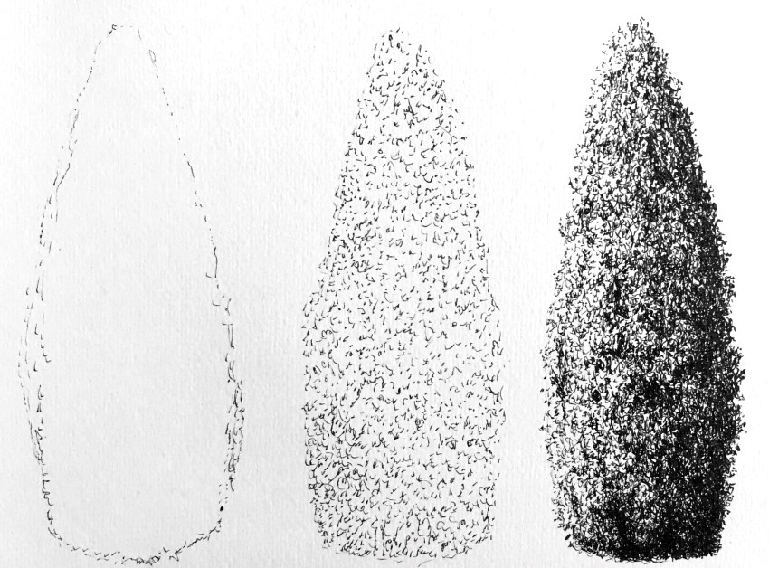
Pine trees come in many types and shapes.
Looking at a reference image can help at the beginning, just as a guide to draw the form and to pay attention to dark and light areas.
Other than that, try to be loose and sketchy with your marks.
When drawing a close-up view, you can indicate the needle-like leaves at the edges of the tree.
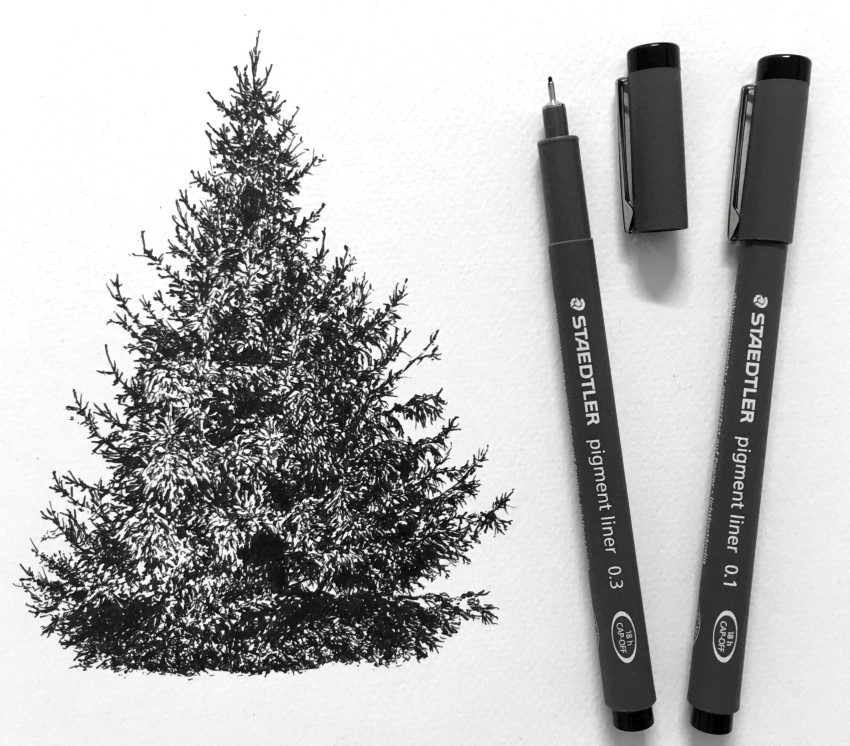 Pine tree
Snowy Pine Tree
A pen has only one brightness value. Therefore, you have to use different techniques to create the illusion of transitions in brightness values.
One technique (or style) is to use hatching. Hatching means drawing parallel lines.
By drawing lines with different degrees of spacing between them (or with different line widths), you can create an illusion of different brightness values.
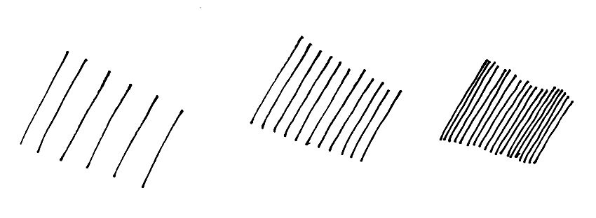
Another method is to use cross-hatching.
Cross-hatching means drawing sets of parallel lines in a different direction. By adding more sets of cross-hatching, you can create the illusion of darker values.

You can use ANY pen for drawing. I prefer artist-grade technical pens (also fine liners). They create lines with fixed width, and their ink is made of pigments, which is very durable and lightfast.
For the snow part, you can leave it empty ("white"), or you can use hatching in some areas.
In this example, I used some hatching and some marks with very light gray marker.
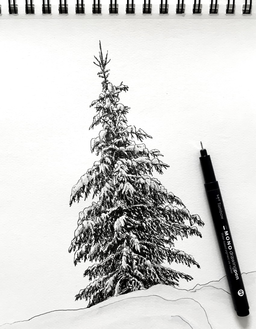 Snowy Pine tree
If you want to know more about markers, visit my markers review for artists.
Christmas Tree
A Christmas tree is just another pine tree, but with decorations.
To add some baubles, first draw their shape, and then try different types of hatching, cross-hatching, and stippling.
Stippling is a drawing technique that uses dots. The more dots you add in one area, the darker it looks.
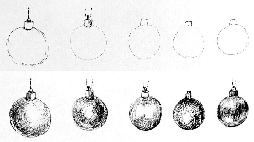
You can add other decorations to your Christmas tree.
It is best to first sketch some test drawings on a different paper to see what works before adding them to your drawing.
To add boxes in perspective, you should be familiar with linear perspective drawing and learn to draw from imagination.

Tip:
If you find it hard to draw a tree with a pen, you can always start with a pencil.
When you reach a satisfying result, you can go over it with a pen and gently erase the pencil marks.
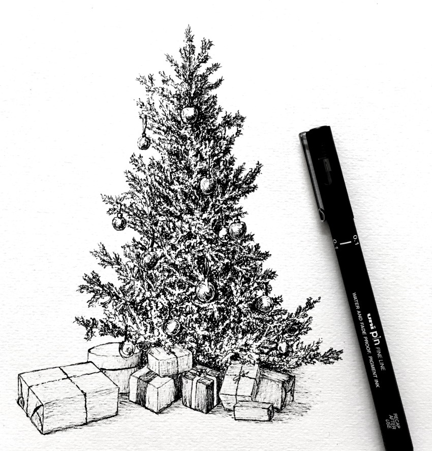 Christmas tree
Drawing with White Pens
When drawing with white pens, pay attention to the same drawing fundamentals.
While with black pens you draw more lines for darker areas, with white pens you should draw more lines for light/bright areas.
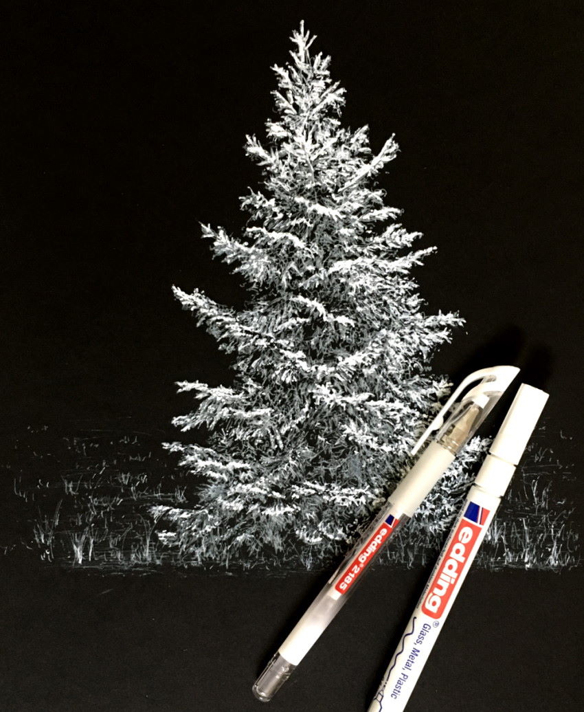
These pens are most effective on black (or dark) paper and for highlights.
Keep in mind:
White pens are designed for covering.
Drawing with a black pen (which has ink) over white areas (made by a white pen) may ruin the pen's nib, because it will be covered with the white substance (therefore its ink will not flow smoothly).
Aspen & Birch Trees
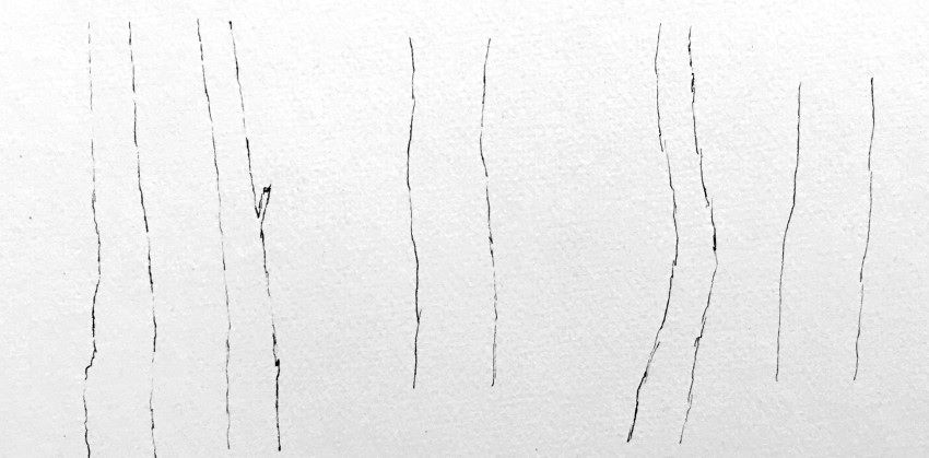
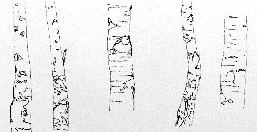
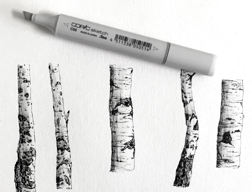
Aspen and birch tree trunks are easy to draw when doing it in steps.
Draw the form first.
Then, add some basic details.
Finally, draw some brightness values and texture.
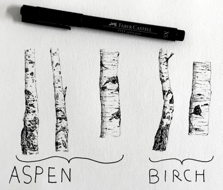 Birch & aspen tree trunks
You can use (light) gray markers for coloring.
Overlapping
Overlapping means an object that partially covers another object.
When you see an object that overlaps another object, you assume that this object is in front of the object it covers.
Overlapping is one of the most powerful ways to draw the illusion of depth on a flat piece of paper.
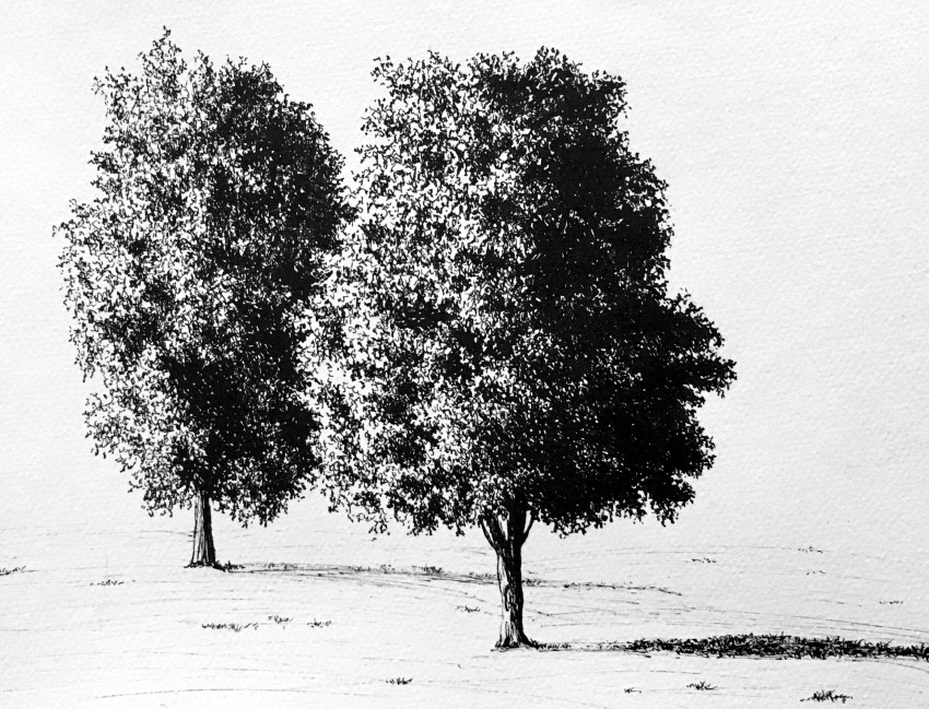 Overlapping trees
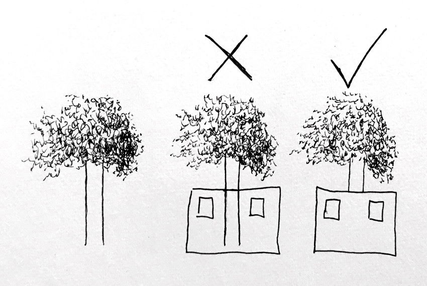
Because you cannot erase pen marks, it is best to draw foreground objects first!
If you want to draw a house in front of a tree, draw the house first.
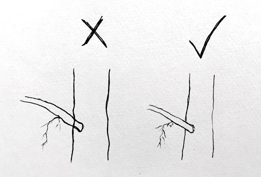
Do the same for tree branches.
First, draw the branch that overlaps a tree, then the tree trunk.
For trees that have a complex structure, with many branches, you can use a pencil to draw the basic shapes.
When you are happy with the result, you can draw over it with a pen and gently erase the pencil marks.
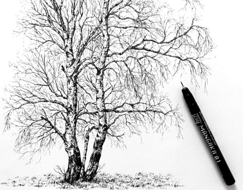 Birch trees
Transitions
Transitions are part of drawing (and painting) fundamentals. They exist everywhere!
For example, different areas of a flat plane have different relationships with any light source, reflections and shadows.
Therefore, always look for transitions (in brightness values) for your drawing to look realistic and natural.
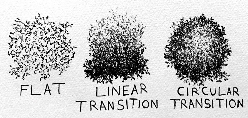
First, look for light and dark areas.
Then, look for transitions within each area. Transitions from dark to light, from light to lighter, and from dark to darker.
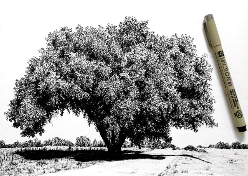 Oak tree
By drawing with NO transitions (and using hard edges), you can draw something that looks unnatural, as opposed to something realistic with transitions.
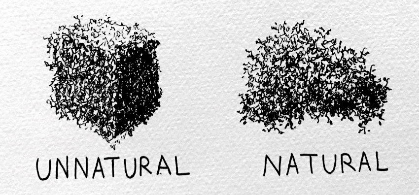
The same way a gardener trims bushes and trees, you can use your artistic license to create something that looks artificial or man-made.
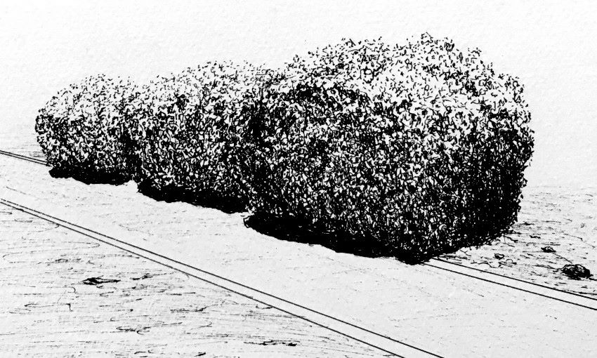
Artistic license means to use your knowledge and experience.
Once you understand how to draw leaves, you can draw anything with leaf texture. Objects, figures, vehicles or even a refrigerator.
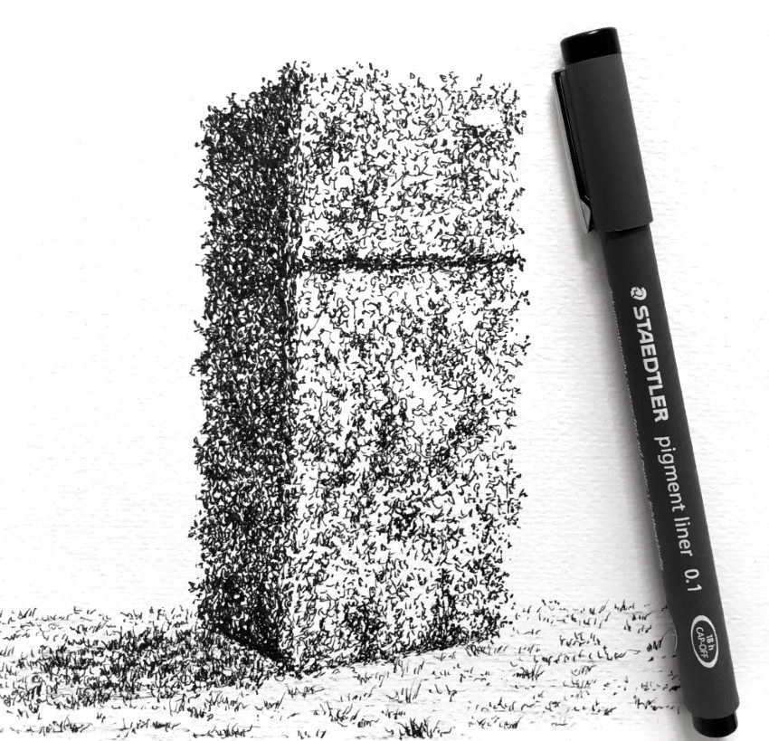
Good to know:
Transitions are not limited to brightness values. Transitions exist in colors, texture, edges and temperature (transition from warm colors to cool colors).
If you are struggling with realistic drawing, you might want to read my realistic pencil-drawing guide. It covers the 4 important fundamentals (accuracy of the form, brightness values, edges and transitions).
Weeping Willow
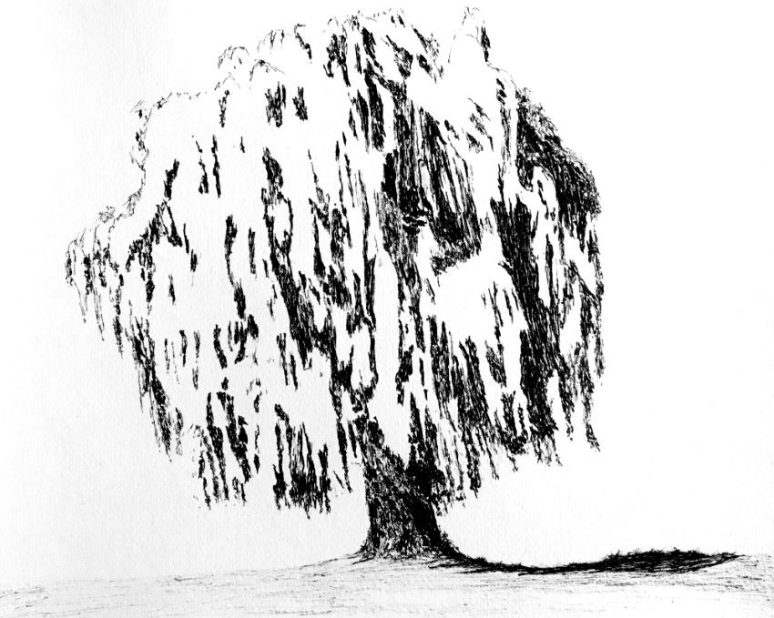
A weeping willow tree is a bit tricky to draw.
Its leaves are easy to draw at an up-close look. As you get farther away, you can see long clusters of leaves with no single leaf shape.
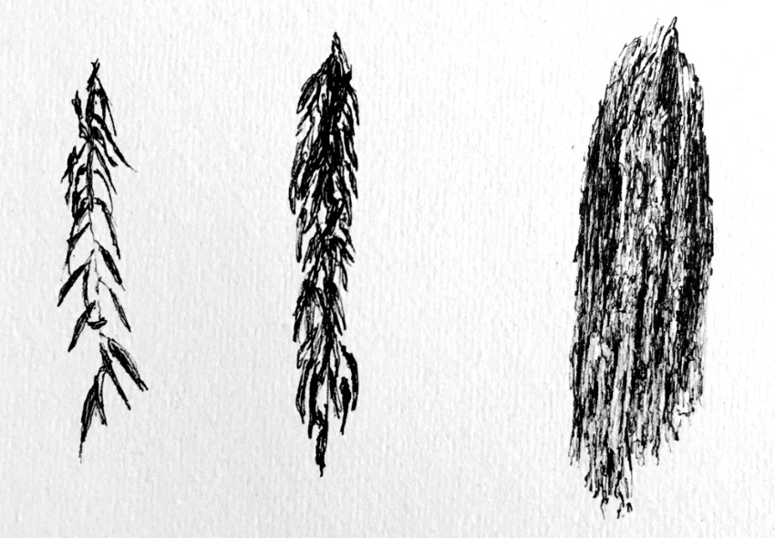
You can start by drawing an outline for the tree structure. Do it gently.
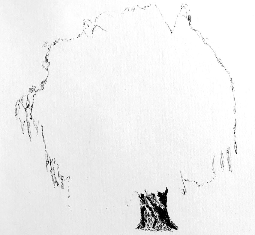
Then, one way is to draw the treetop (crown), section by section.
Alternatively, like in this example, you can draw the dark values first.
Something to consider:
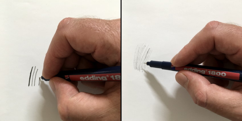
As mentioned above, a pen has one brightness value (usually black, though other colors exist).
By drawing gently and swiftly with a sharp angle, you can produce lines that are less defined and therefore have a lighter value.
The last step is to add the light values.
Pay attention to brightness values, transitions, and texture. Be abstract with your marks, yet with a sense of direction.
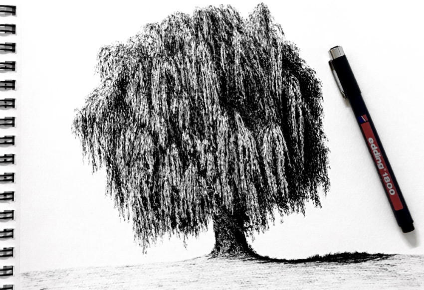 Weeping Willow
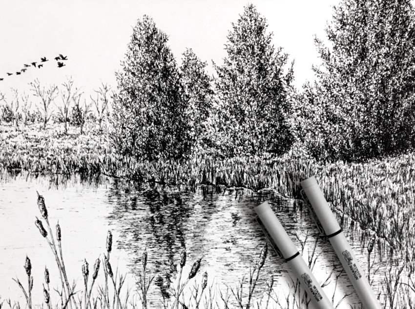 Landscape pen drawing
I use the same paper brands for drawing with pencils, pens, and markers.
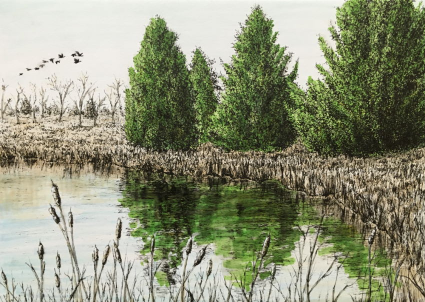 Coloring with markers
Pens and markers (mixed media) work great together.
When I want a higher level of realism, I draw the base layer with markers and go over it with colored pencils (for details, texture, highlights, and shadows).
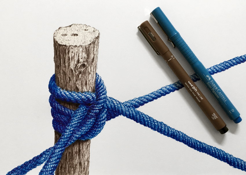
 Stone and stick
Log
To draw logs, timber, or tree trunks, start by drawing the outlines gently.
Pay attention to foreshortening and add some basic details.
Lastly, decide where to place the light source and draw a gradual transition in brightness values with sketchy marks.
If you struggle with the perspective of cylinders, visit my elliptical object drawing guide.
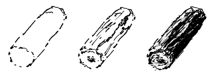
Transitions:
A cylindrical object has a transition in brightness values, from dark to light.
When using a black pen, draw more lines for darker areas.
Another option is to draw less defined lines (swiftly at an angle) and add more lines for darker values.

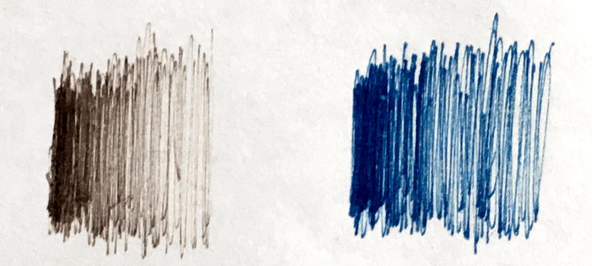
Colored pens:
Unlike black pens, colored pens come in different levels of opacity.
When drawing more in the same area, the pen creates a darker value. Sometimes you can let the pen ink dry and then draw over it again.
Edges:
Cast shadows usually have soft edges (see below how the cast shadow from the rope has a soft edge).
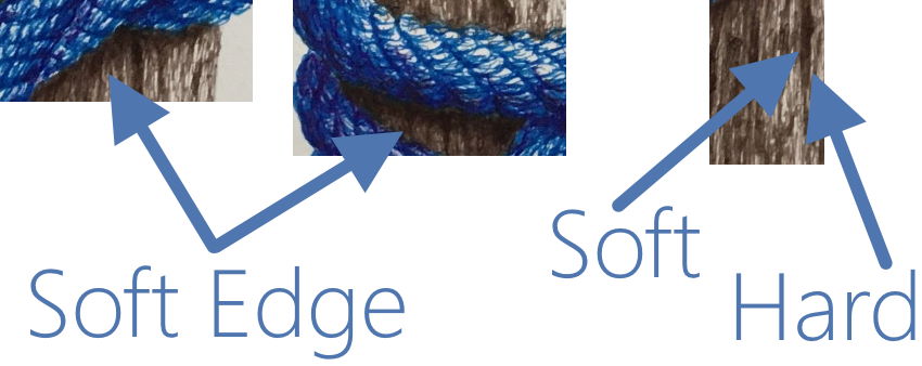
For a more realistic rendering, with more details, draw big.
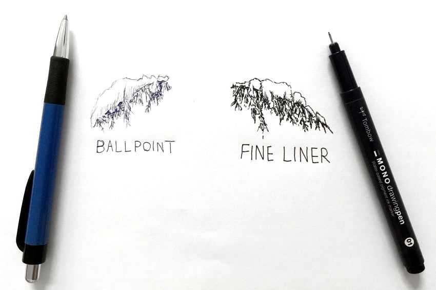
Ballpoint Pen
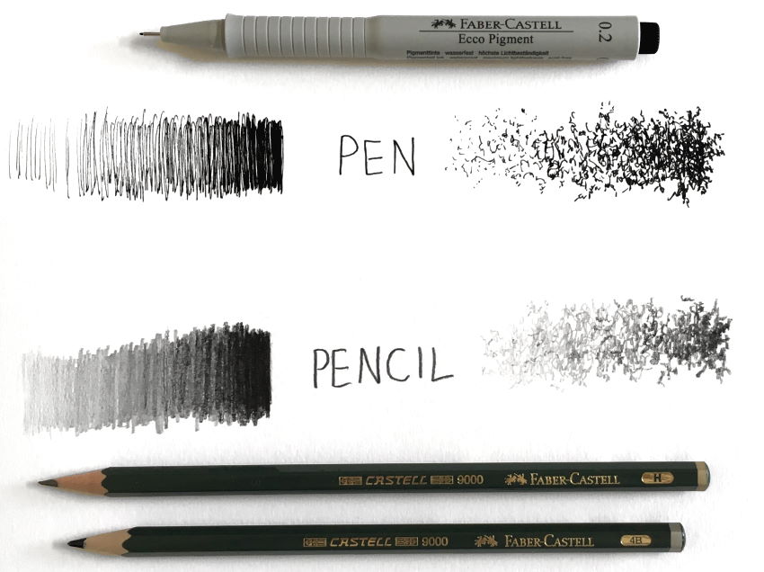
With a technical pen, the key is to draw more lines for dark values, and vice versa.
Pencils can produce different values, depending on how many graphite particles you lay on paper.
Ballpoint pens are something between a technical pen and a pencil.
Meaning, they do produce a variety of values, yet they are permanent (not erasable).
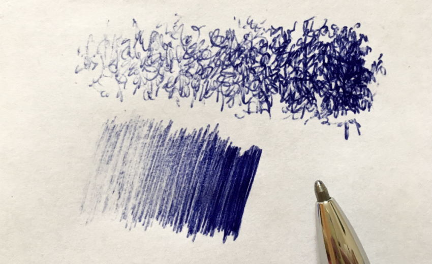
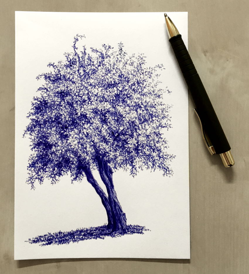
A ballpoint pen can be a versatile drawing tool once you get used to the amount of pressure and angle of drawing.
How to Draw Trees with Pencils
When drawing with pens, you create the illusion of different brightness values by drawing different amounts of lines.
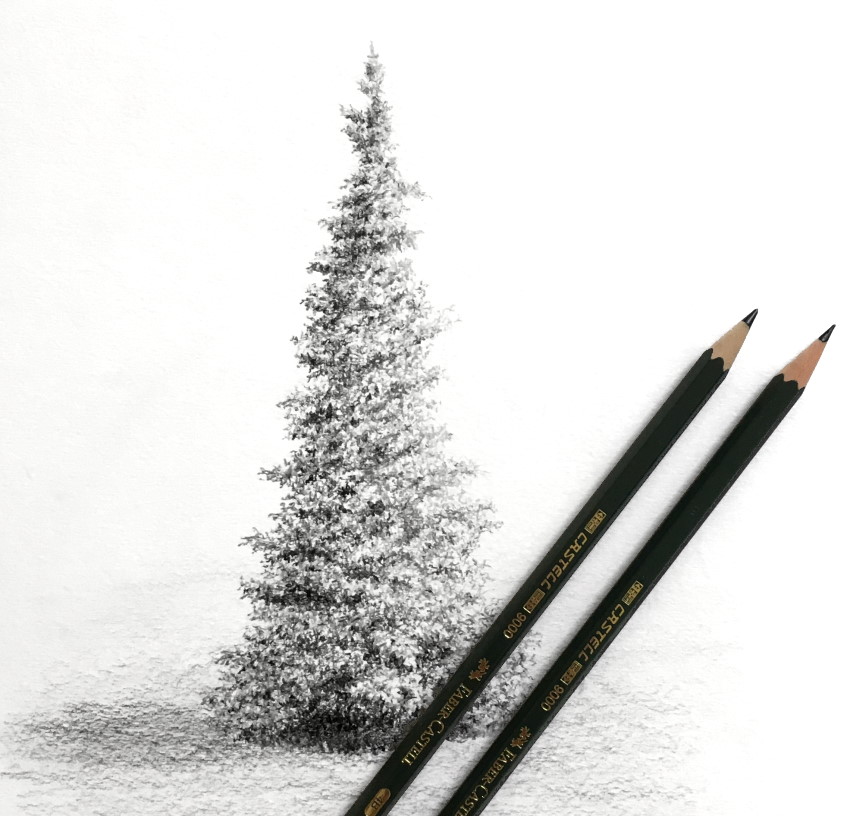
With pencils, you can actually draw different brightness values.
While with pens you draw lines, with pencils you draw stains or smudge the surface, as if you are drawing with a brush.
I usually draw the structure first.
For a tall tree, I draw from top to bottom so not to smudge the graphite particles.
If the tree is wide, I draw from left to right (because I am right-handed).
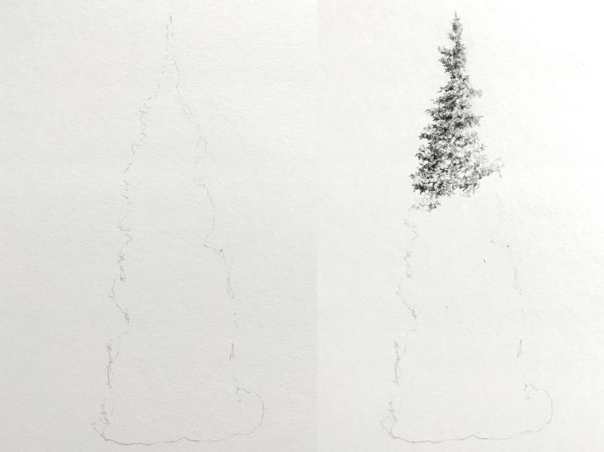
Make sure there is enough contrast between dark and light areas, and that you are abstract with your marks.
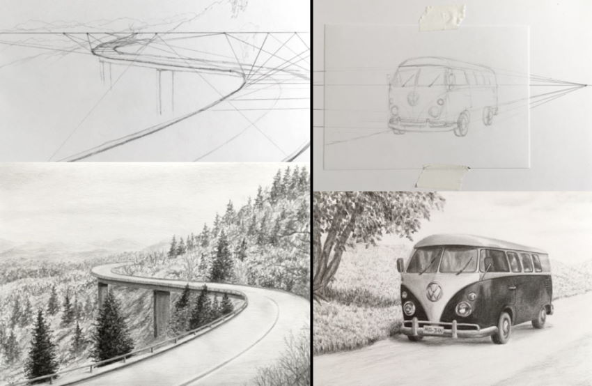
When drawing landscapes, especially with roads, use linear perspective to draw it accurately.
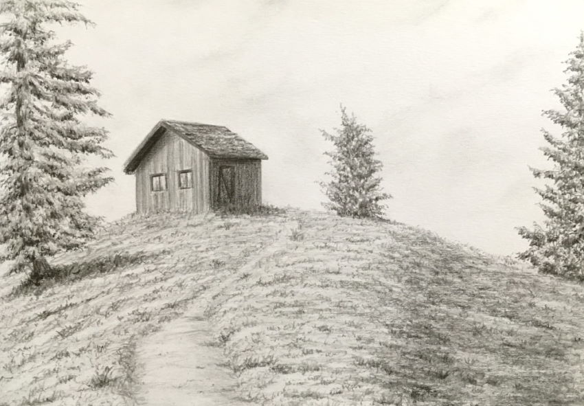
You can visit my guide on linear perspective for beginners.
For a tree trunk, I start with the structure.
As mentioned above, I draw from left to right and top to bottom.
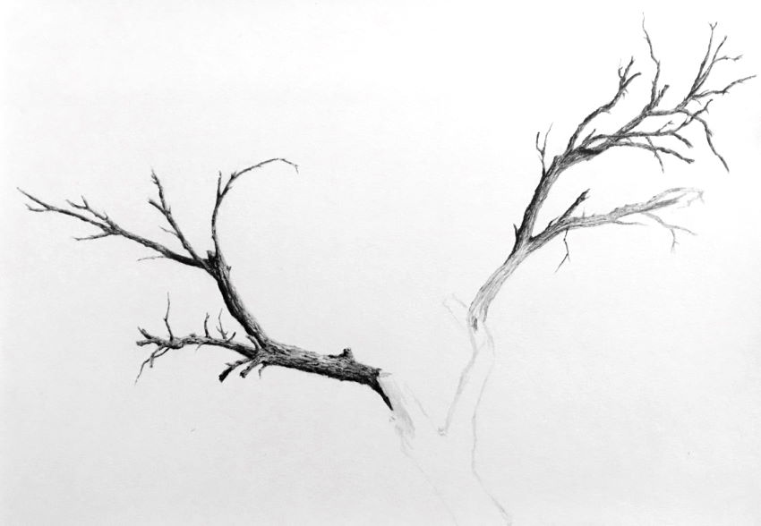
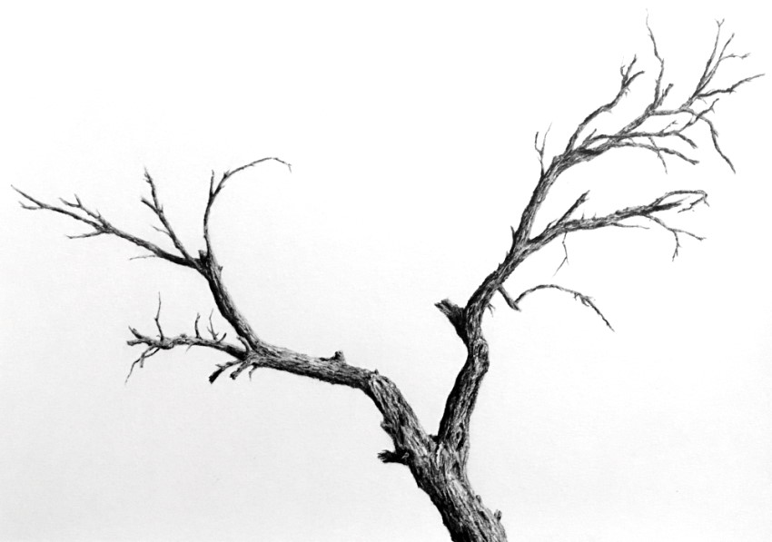
Then, I draw each branch in layers.
I focus first on brightness values and gradually adding details.

Trees are hard objects with hard edges.
If the edges of the tree are not super sharp, you can use an eraser to sharpen them.
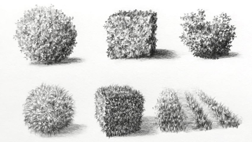
To learn how to shade a ball, visit my sphere drawing guide.
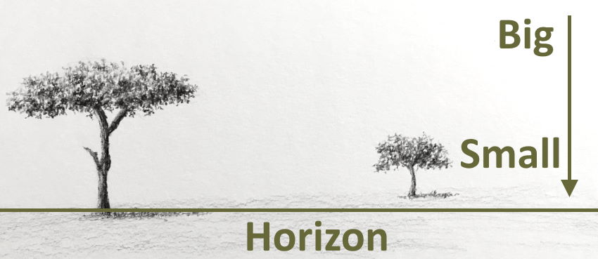
Horizon
As mentioned above, there is no actual depth when drawing.
Instead, pay attention to height in relation to the horizon line.
Below the horizon, farther objects are higher toward the horizon line.
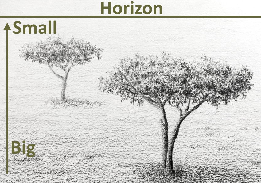
The opposite phenomenon occurs above the horizon line.
Meaning, farther objects are lower toward the horizon line.
In many cases, the horizon line is not above or below trees but on them.
In these cases, the top part of the trees is lower when they are far away, and the bottom part of the trees is higher when they are far away.
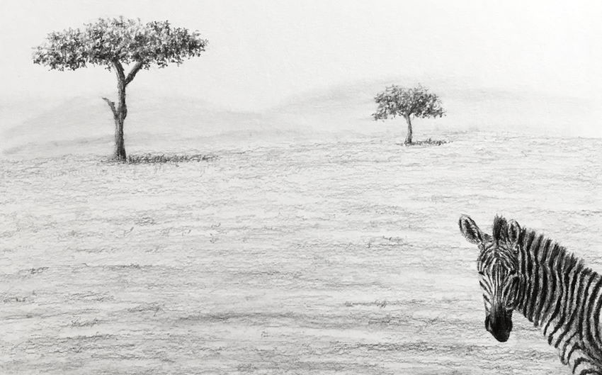
In any case, distant objects appear smaller.
Mixed Media
The same way you can use a pen with markers, you can use other mediums.
In the next example, I used a pen for drawing a tree, and pencils for drawing the Polaroid photo.
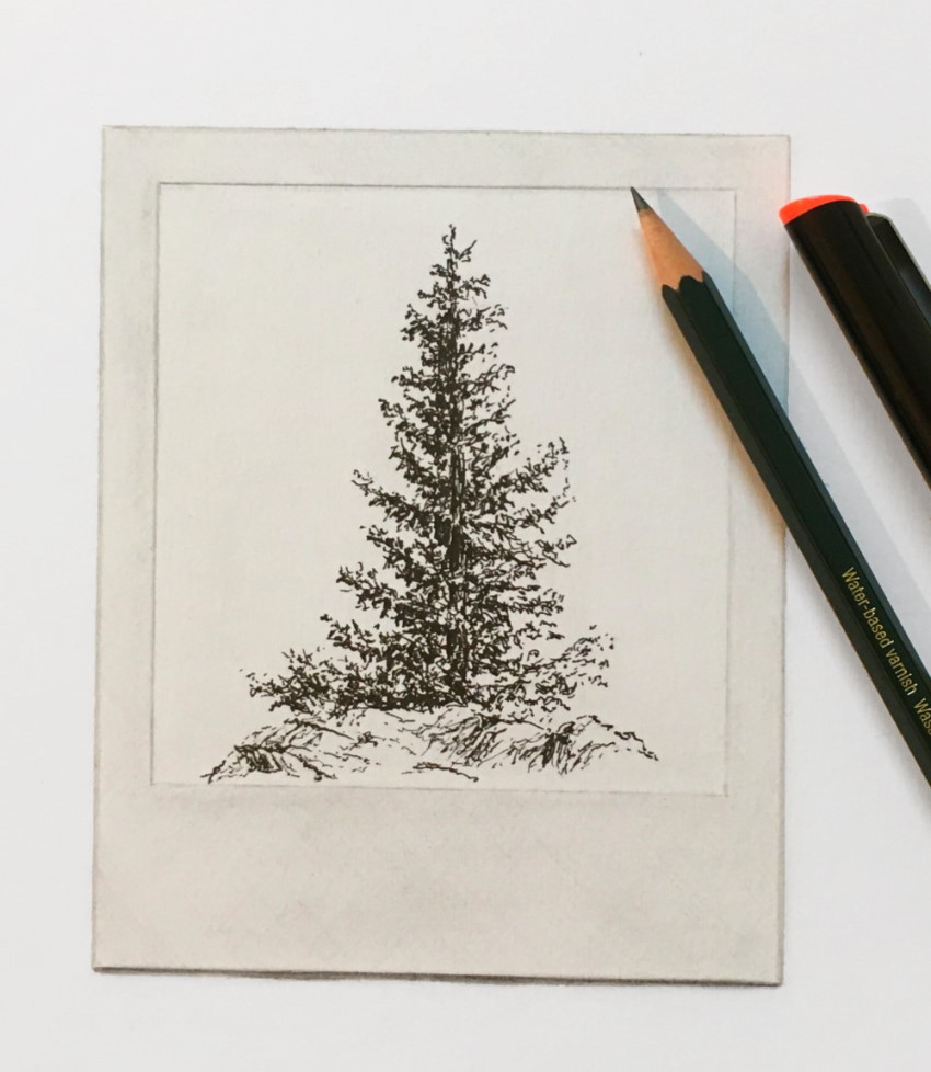
You do not have to limit yourself to 2 mediums.
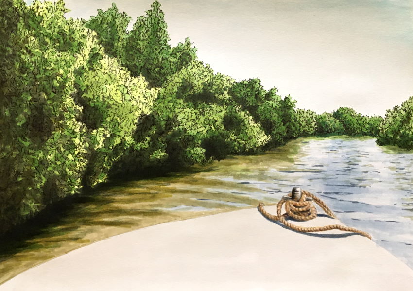
Here is an example with 4 mediums.
Pen and markers for the trees. Markers and colored pencils for the rope. Watercolors for the sky and boat.
Colored Pencils
To draw with colored pencils, you should have a basic understanding of how to mix colors for painting.
For this example, I mixed blue and yellow (to create green).
The key for mixing colors with colored pencils is to work with many layers (blue, then yellow, then blue, then yellow, and so on).
The more layers you add, the more pigments are on the drawing surface, and it is easier for them to mix.
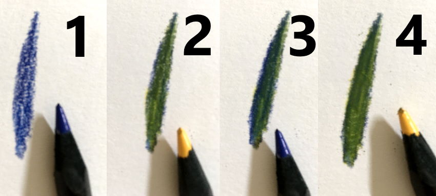
Do not press too hard when adding layers.
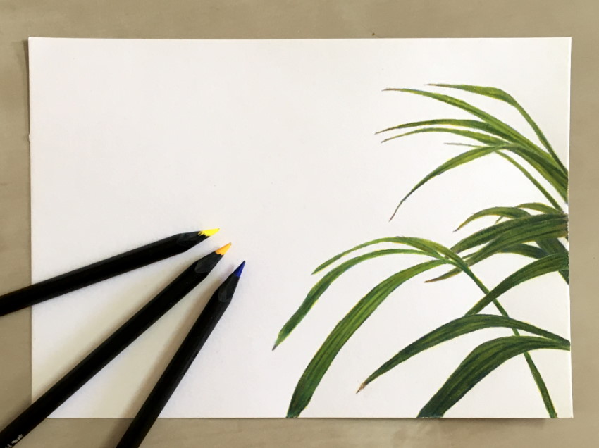
For realism, I use markers as the base layer and I add details with colored pencils.
Tip:
Colors in nature are less saturated. Using a toned paper reduces the saturation of colors.
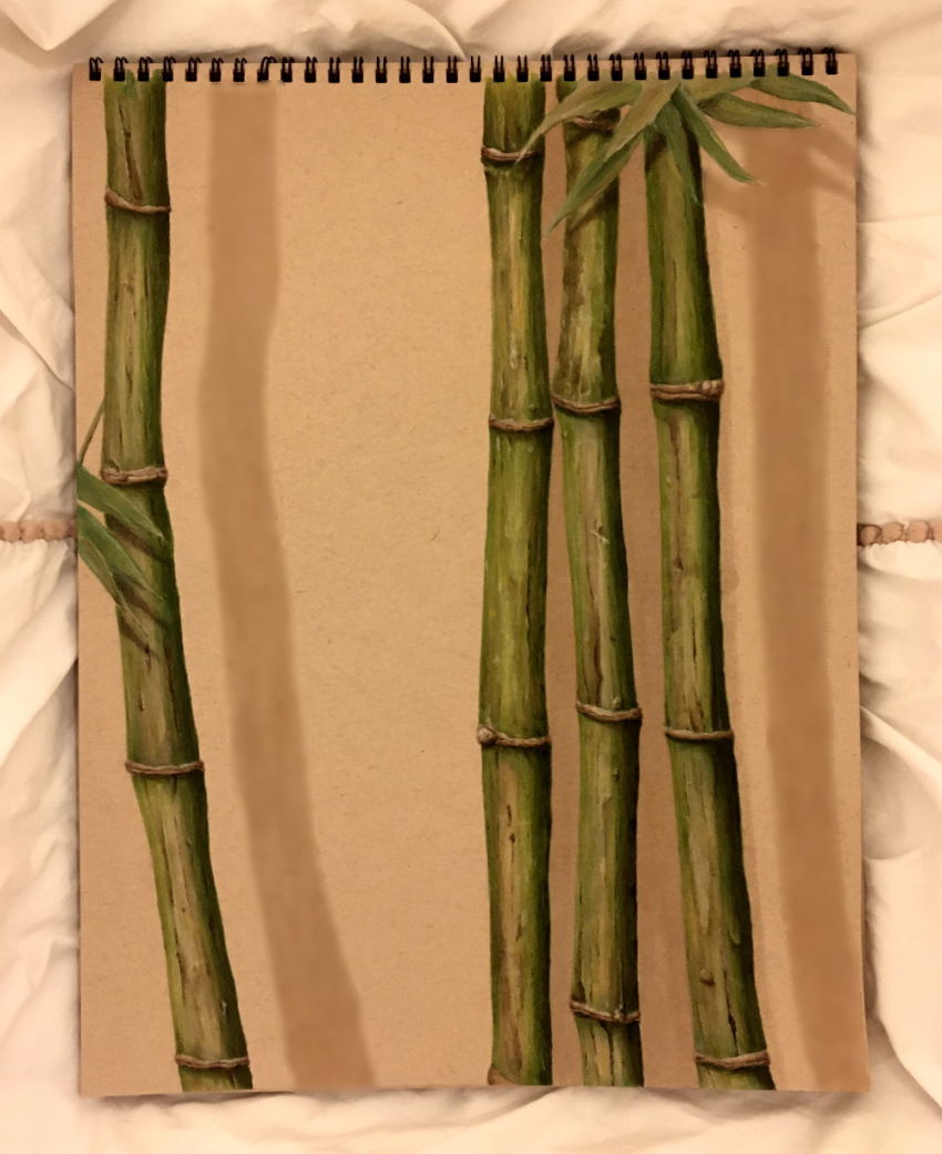
Summary
While there are no lines in nature, pens can only create lines!
Drawing is creating an illusion. The world is three-dimensional, but your paper sheet is two-dimensional.
To create this illusion, pay attention to brightness values, edges and transitions (among other things).
A pen has only one brightness value, so, unlike other drawing mediums (graphite, charcoal, pastel, etc.), you have to create the illusion of different brightness values and transitions (in brightness values).
When drawing trees, focus on the accuracy of the form and on brightness values.
Make sure you have enough contrast between highlights and shadows for the drawing to be noticeable.
Trees are a part of many drawings, especially landscape and cityscape.
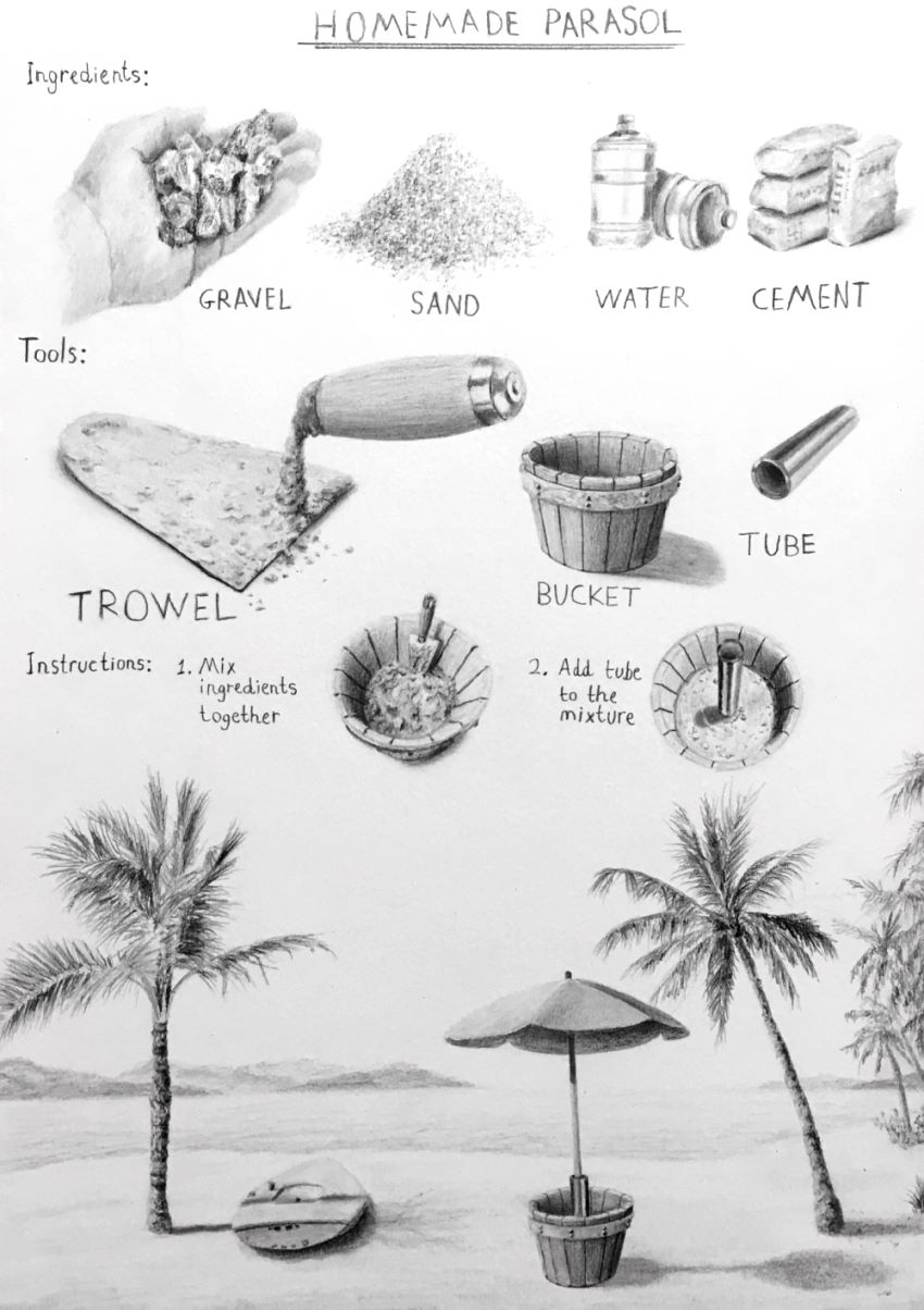 Homemade parasol, product design drawing
After you master drawing the form and brightness values, details (texture) make all the difference.
Here is my realistic texture drawing guide.
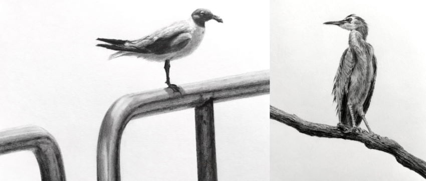
If you liked this article, you might like my flower pen-drawing guide too.
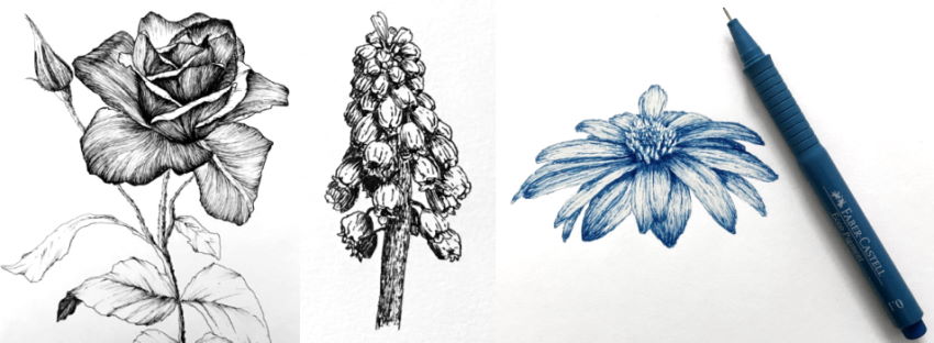
For my recommended pens that I used in this guide, visit my review for fine-liners and technical pens for drawing.
