The 8 Key Factors for Painting Realism
Updated: 10 Jun 2026
This guide is an introduction to painting fine art realistically.
Realism is all about accuracy. The most important factors are accuracy of the structure and accuracy in brightness values. When you get these two factors right, success is guaranteed.
My 8 key factors in achieving realistic results are:
- Precision - accurate drawing from observation.
- Values - brightness values.
- Contrast - contrast range in brightness values.
- Edges - sharp or soft.
- Transitions - in brightness values, colors, texture, edges, and temperature.
- Temperature - warm and cool colors.
- Colors - the object's fingerprint.
- Saturation - how sharp and rich colors are.
Understanding these characteristics applies to ANY medium. I.e., pastels, oil paints, acrylics, watercolors, etc.
In addition, you should understand the laws of nature, perspective (linear and atmospheric), depth, geometry, and color mixing.
Note:
At the end of this tutorial, you can find useful painting tips and a summary.
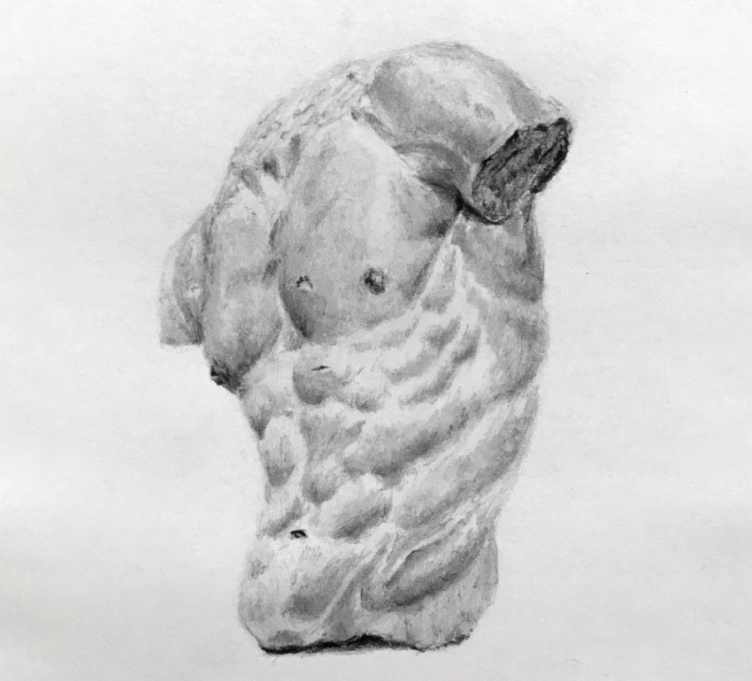
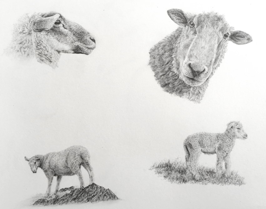
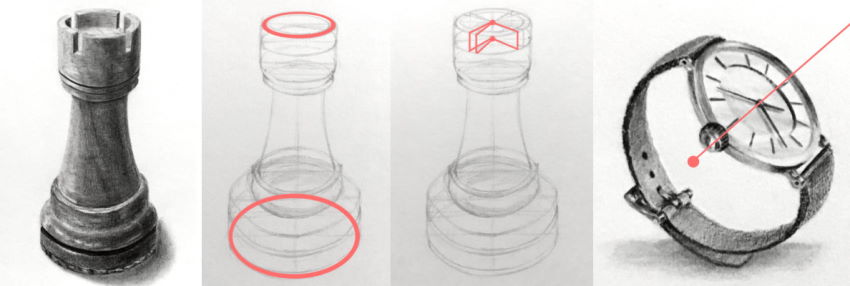
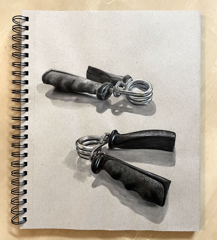
1. Precision
Precise drawing is the ability to draw ANYTHING from observation.
With knowledge and experience, you can draw any style (portraits, still life, landscape, the animal kingdom, etc.) and any type of texture (glass, metal, hair, skin, paper, fabric, etc.).
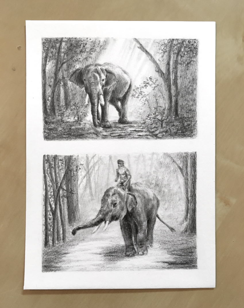
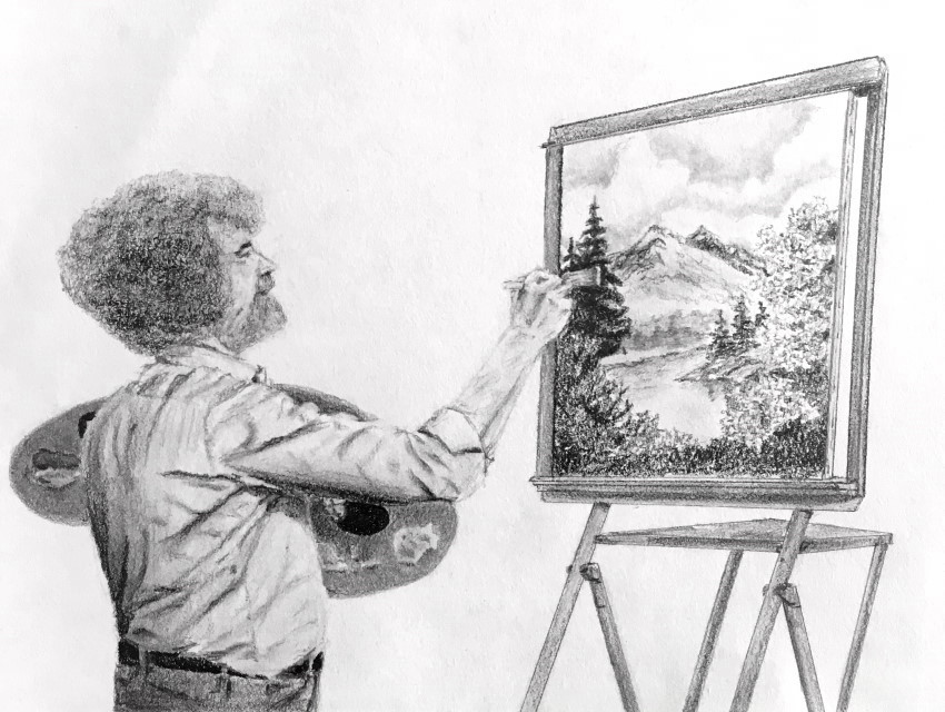 Bob Ross, graphite sketch
The advantage of learning to draw before (or alongside) learning to paint is realizing the importance of precision, brightness values, edges, and transitions.
 Pencil drawing, great white shark
Important:
Being accurate in the initial sketch is crucial. Accuracy is a synonym for likeness, meaning a credible result.
Therefore, pay attention to shapes, proportions, and anatomy.
If you struggle with accuracy, visit my guide on how to draw from observation.
2. Brightness Values
Brightness value (also called value or tone) is how dark or light any part of a painting is.
By using dark and light values, you can create a three-dimensional illusion on a two-dimensional surface, thus creating an illusion of depth in a painting.
The more accurate the brightness values are, the level of realism increases. Therefore, accuracy in brightness values is critical!
It is less complicated to see the difference in values in a monochromatic drawing or painting. With colors, it is a bit more challenging.
The way to understand and apply values is to first understand their importance.
Then, observation is the key. Meaning looking at any part of an object or surface and trying to determine how dark or light it is.
One way to determine the value of an object is to blink a little or close the eyes slightly in order to lose focus.
While out of focus, the texture of an object becomes less noticeable, and it is easier to detect its brightness level.
With your eyes partially closed, you can compare your painting to the object or image you are trying to paint and see which is darker or lighter.
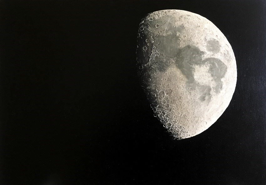 Moon oil painting: Details & depth are variations in brightness values
Tip:
There is only one color (gray) when drawing with graphite pencils, so the focus is on brightness values.
Therefore, drawing is a good foundation for learning to paint.
For a more in-depth tutorial on drawing, read my guide to realistic pencil drawing.
3. Contrast
Contrast in brightness values is important.
When the dark parts of a painting are not dark enough or the light parts are not light enough, the painting looks flat or dull.
When there is enough contrast, meaning a big range in brightness values, from deep shadows to bright highlights, the painting (or drawing) has more presence and depth.
 Contrast to add depth
To understand depth, read my 15 methods guide on how to draw depth.
Shiny or reflective objects usually have strong contrast.
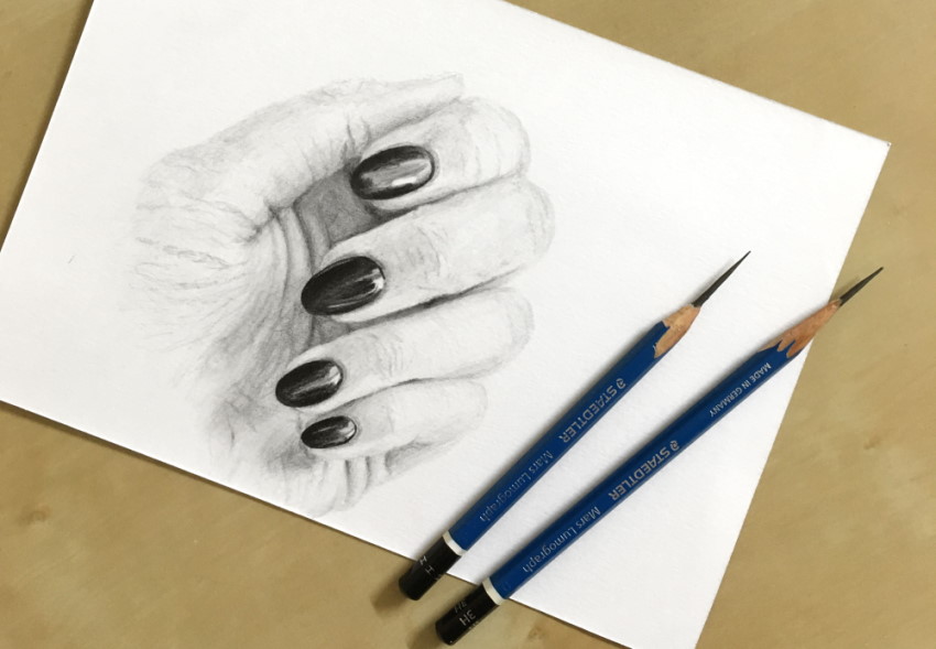 Shiny nail polish has strong contrast
Tip:
When drawing, the lightest you can go is not drawing at all. Meaning, the brightness value of the paper.
Therefore, to get a strong contrast, you have to draw the dark areas darker.
With colors, you can mix more white to any color for a lighter value.
When drawing round objects, you might want to check my round object drawing guide.
To give an object more presence, add contrast to it (darker shadows and lighter highlights).
Draw or paint with less contrast around it.
4. Edges
There are no lines in nature!
In the past, when the laws of perspective were still not fully understood, there was extensive use of contour lines to delineate objects and figures.
Unlike cartoon and comics drawing, which is characterized by drawing outlines, when painting realism, painted objects have no lines.
Every part, area, or surface of an object ends. Where an object or part of an object ends is its edge.
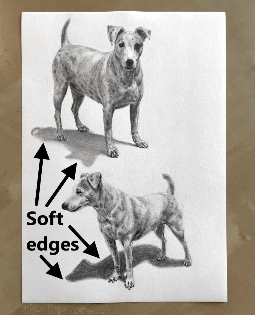
Edges can be hard (sharp) or soft (blurry). When an object or a figure has a soft edge, it looks less sharp and out of focus.
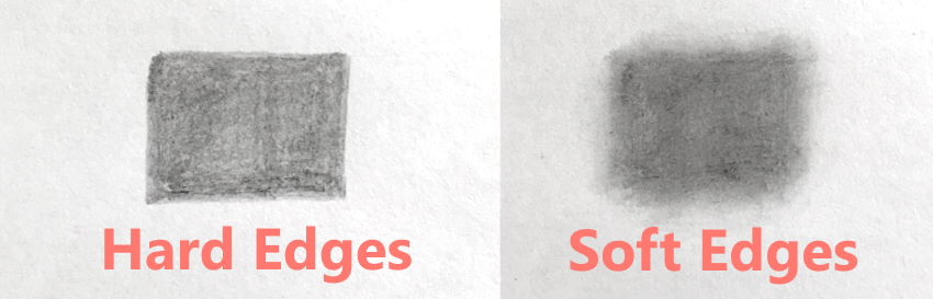
Soft objects such as hair, fur, and fabric have soft edges.
Clouds and smoke have soft edges too.
Cast shadows usually have soft edges.
When drawing with graphite pencils, I use a synthetic brush and a blending stump to blur the edges.
Here you can find more about my recommended drawing materials for realistic drawing.
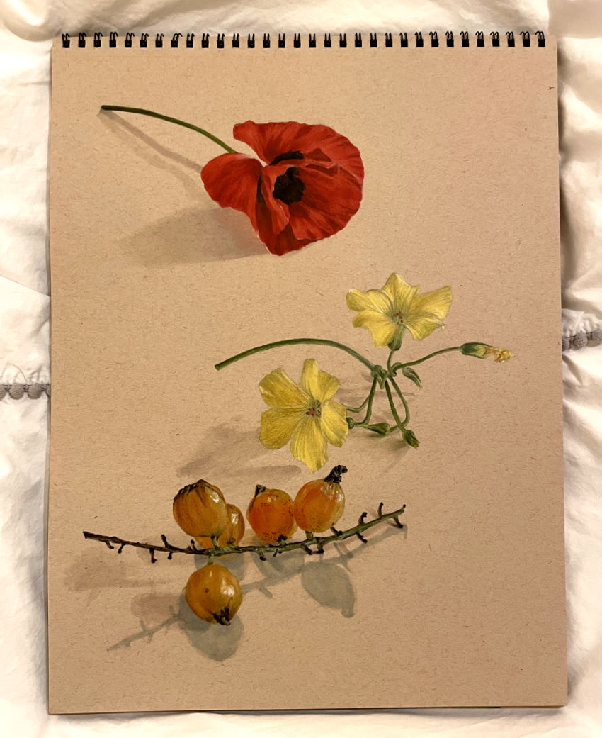
In the next example, I used markers and colored pencils. The flowers have hard edges, while the cast shadows have soft edges.
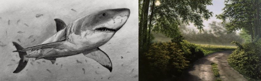
In landscape paintings, and in accordance with the laws of atmospheric perspective, the more distant an object is, it looks less clear, meaning not in focus, and therefore its edges are softer.
Here I used oil paints.
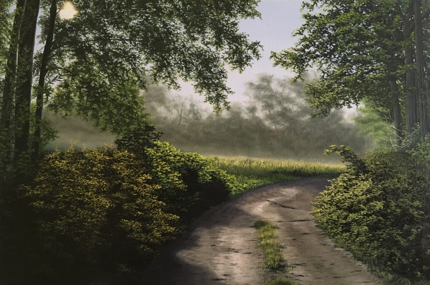 Distant trees have soft edges as opposed to the sharp edges of the nearest trees
Important:
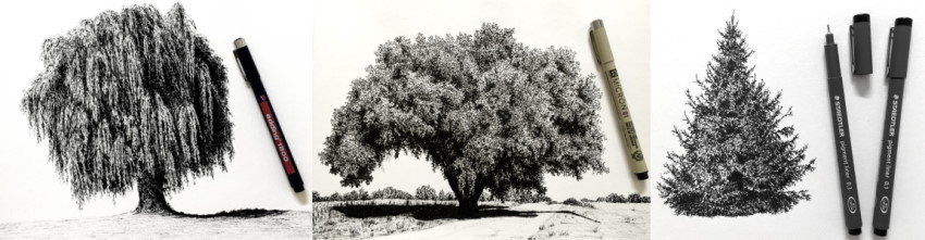
Learning a technique to paint a specific object is wrong. If you learn to paint a specific tree, what happens if you want to paint a different type of tree?
Feel free to visit my guide for drawing trees.
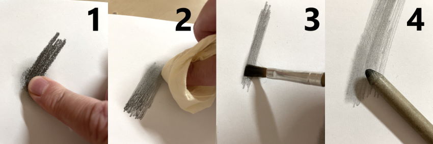
Smudging (soft edges) methods:
Avoid smudging with your finger (1) so as not to transfer body oils to the drawing paper.
Smudging with a piece of paper (2) is possible but less accurate.
Using a flat synthetic brush (3) is my favorite way.
A blending stump (4) is a powerful way to smudge and should be used gently.
5. Transitions
Transitions in a painting are changes that exist in an object or a surface.
There are many types of transitions. Some common types are:
- Transition in value, from dark to light.
- Transition in colors or shades, from one hue to another.
- Transition in temperature, from warm colors to cool colors.
- Transition in texture, from soft to rough surface.
- Transition in edges, from sharp to blurry.
- Transition in saturation, from vivid, rich colors to dull colors.
For example, a sharp shift in brightness values produces a sharp edge and a sharp angle. In contrast, a gradual transition in brightness values produces a soft edge and convex objects:
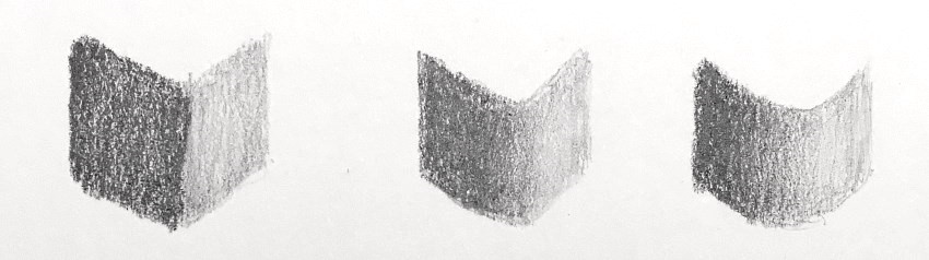 Transitions in values
Each part of an object or a surface has different relationships with any light source.
Therefore, some parts of a tile are closer to a light source or at a different angle, meaning there are always transitions.
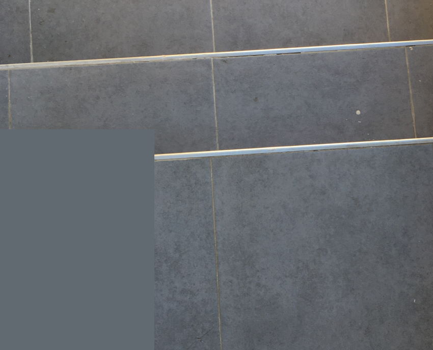
Sometimes transitions occur due to reflection, like reflection of the sky.
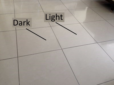 Transition due to lighting
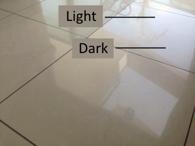 Transition due to reflection
When painting, the change in transitions is more significant because, usually, a small part of a canvas represents a much larger area in reality, particularly in landscape painting.
So, pay attention to transitions in order not to create a flat, unnatural surface.
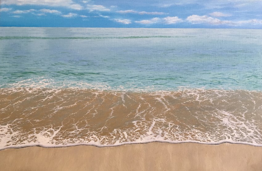 Transition of colors in the sky: from greenish blue in the left to purplish blue in the right
6. Color Temperature
Temperature is how cool or warm colors are.
- Purple, blue and green are cool colors; they bring to mind cold things like the ocean.
- Red, orange and yellow are warm colors; they bring to mind hot things like fire or the Sun.
A cool or warm color can be warmer or cooler.
For example, cadmium yellow is a warm yellow because it is an orangey yellow.
Lemon yellow, on the other hand, is a cooler yellow because it is a greenish yellow. It is still a yellow and therefore a warm color, just a bit cooler.
In reality, the lighting issue is complex. For example, the warm light from the sun produces warm areas, but the shadow areas are illuminated by the sky, which is the secondary light source.
On a clear day, when the sky is blue, the shadow color is cool, slightly purple or blue.
Therefore, on a clear day, due to the influence of atmospheric perspective and the blue sky, the distant areas of a painting are cooler (because there are more atmospheric particles between them and the observer), and the close areas have warmer colors.
 Despite the warm sunlight, the shadows are cool (purple) because of the sky
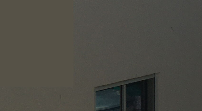
In indoor lighting, there can be several artificial light sources (cool, warm, or a combination of both), including cool skylight (or warm direct sunlight), and reflections from the surroundings, such as the color of the walls.
Can you see the color temperature on the wall?
For realistic results, you need to train your eyes to notice color temperature.
In the next example, the top part of the wall has warm color due to warm artificial light and reflections. The bottom part of the wall receives direct cool light from the sky (via the window).
 Transition from warm to cool color
In most cases, try to avoid white, black or gray when painting realism.
An exception is when painting the Sun (not at sunset, though).
 The Sun is usually white
Pure, neutral gray does rarely exist in nature.
Instead, examine the temperature of the color you think is gray.
Here is an example of a cool gray.
And an example of a warm gray.
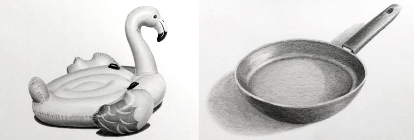
7. Colors
Each object is built from specific pigments, thus identified with a unique color.
Color serves as the object's fingerprint.
To be accurate in choosing colors, you need to master the craft of color mixing and understand the relationships within the color wheel.
Colors change during the day depending on lighting, climate conditions, and other factors, yet each object has color characteristics determined by the pigments it is made from.
In some cases, inaccuracy in color mixing may not be critical, as long as the values are accurate, but inaccuracy in values produces unrealistic results.
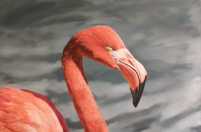 Flamingo has a unique color that represents it
To define the exact color you want to use, pay attention to 4 color attributes:
- Hue
- Brightness values
- Temperature
- Saturation
To learn more about relationships within the color wheel and to master the color mixing process, check out my guide on how to mix oil paints.
8. Saturation
Saturation is how sharp and rich a certain shade of color is, or how dull and gray it is.
Without any color at all, the hue is gray. In contrast, pure color, that is, maximum saturation, is generated by the use of a single wavelength, like a laser beam.
Thus, saturation is determined by the variety of wavelengths that make up the hue and their relative intensity.
Add white, black, gray, or brown to a certain shade to reduce its saturation as needed.
In nature, colors are somewhat gray. Adding a bit of the opposite color in the color wheel to any color makes it less saturated.
With experience in color mixing, it is easy to notice how saturated any part of an object is.
An example of using less saturated colors:
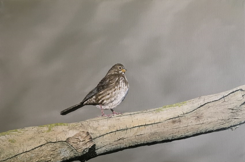 Oil painting, bird
It is a good practice to create color palettes or color charts. As a reference, color palettes are a quick solution to mix the correct color.
For each pigment (or mixture of two pigments), add white gradually.
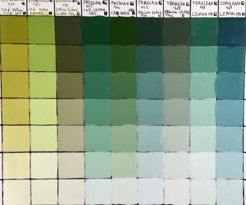 Green palette (mixture of blue & yellow)
When drawing with markers, I sometimes like to use toned paper to reduce the saturation and therefore achieve a realistic result.
Painting Tips
Paint what you see, NOT what you know.
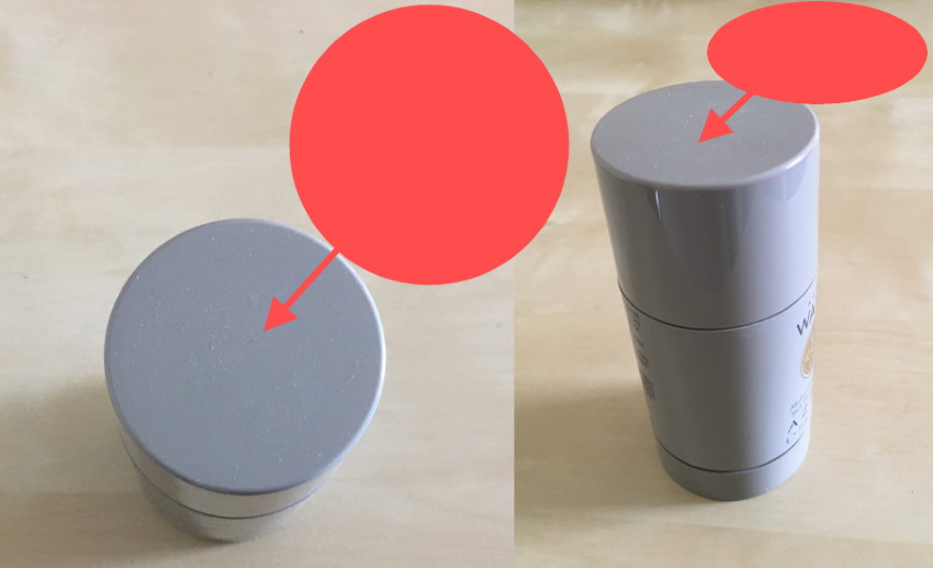
To start with, try to focus on what you see. In the next example, you know that the top of a cylinder is round (circle).
When you look at it from a side view, you do not paint what you know; you paint what you see, meaning an ellipse (foreshortened circle).
With practice and knowledge, the process can be reversed, and you can draw from your imagination.
My guide for drawing from imagination is advanced, but I did my best to explain it in a simple way so beginners can understand it too.
If it is hard for you to see accurately, try to close one eye when observing an object or a scene.
The world is two-dimensional.
Actually, the world is three-dimensional, but you draw and paint on a two-dimensional surface, like paper or canvas.
Therefore, you need to get used to looking at the world in a two-dimensional way.
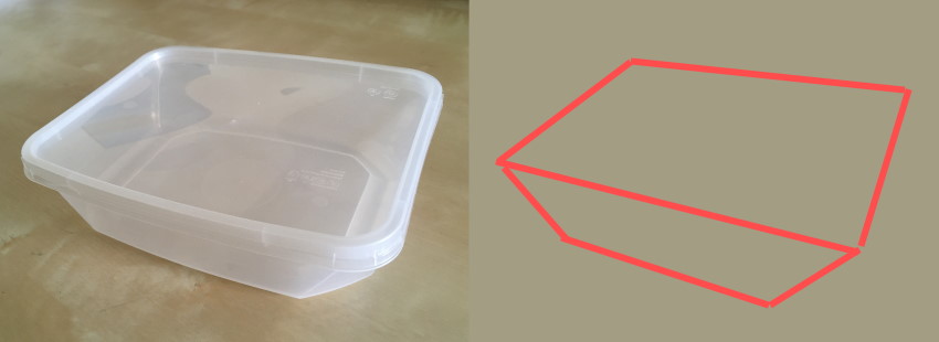
For example, you know the top part of a box has depth, but you disregard it and look only for angles because your surface is two-dimensional:
Kill the colors.
As mentioned above, the world is quite desaturated, so reduce saturation when you paint.
For MANY painting tips and inspiration from top realistic painters, visit painting tips by fine art painters.
Divide and conquer.
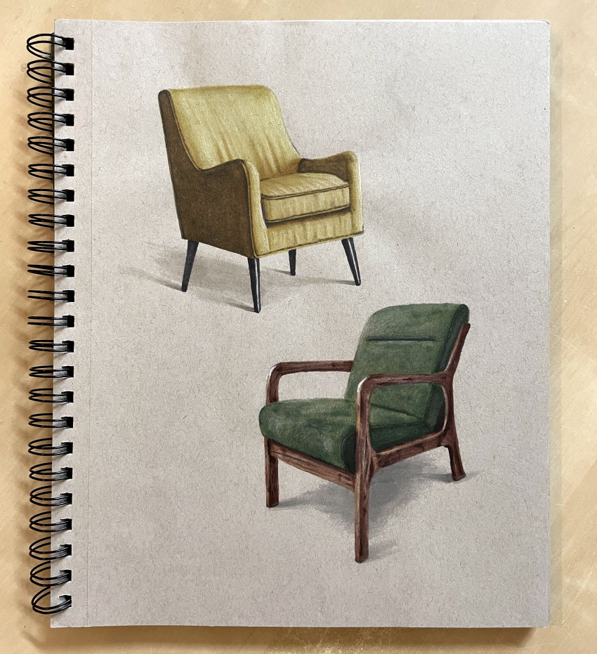
When the painting subject is complex, you can draw and render it in stages.
It is rewarding to invest a lot of time in a painting to achieve a satisfactory result.
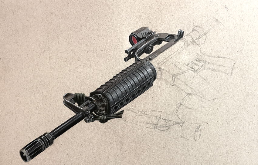
I drew the M16 rifle with colored pencils.

When capturing objects (for drawing or painting), I always favor dynamic, angled perspectives over flat front or side views, which often lack depth. This composition drawing guide is designed to help you master dimensional drawing and bring your subjects to life.
Summary
Precision:
Accurate drawing is crucial and the key when drawing portraits. Each person has a unique facial structure, and any change to the structure changes the likeness of that figure.
Different animals have different anatomical structures. A horse, for example, has an anatomical structure different from a donkey or a zebra.
Values:
Correct brightness values are critical in achieving realism.
The way to get the values right is to observe by asking if the painted object is darker or lighter than the reference object and then to correct the value accordingly.
Contrast:
Contrast range between dark and light should be large enough in order to create an intense, rich painting.
Contrast in temperature (warm and cool colors), complementary colors, edges, texture, or any other factor is important too.
Edges:
Pay attention to soft and hard edges.
You can use your "artistic license" by changing the edges, making an object look closer and in focus, or distant and blurry.
Remember that "artistic license" is, in a sense, a distortion of reality and should be used sparingly when painting realism.
In order to add an object to a painting, use "scientific license," meaning your knowledge of linear and atmospheric perspective, geometry, climate, and light source.
Transitions:
Transitions of different types exist in every area of the painting.
Sometimes, it is difficult to see them when there are so many distractions, such as objects, textures, shadows, reflections, and colors.
Temperature:
Temperature determines the overall atmosphere of a painting.
Colors:
Any object is identified by its colors.
An olive tree, for example, has a unique green color that is different from other trees, and therefore it is important to be precise when mixing colors.
Saturation:
Nature is somewhat gray. The level of saturation should be inspected carefully.
For ALL factors that are part of a realistic painting, OBSERVATION is the key!
Remember:
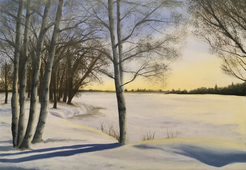
In most cases, avoid using white, black, and neutral gray. Always look for temperature.
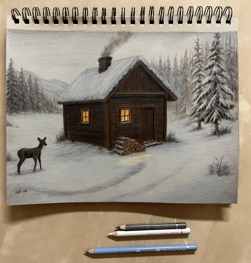
In the next example, the snow is not white. It is affected by climate.
Where to Go Next?
To learn perspective, visit my beginners guide to linear and atmospheric perspective.
After getting the structure and values right, you can focus on texture drawing.
For learning to draw and paint online, check out my list of recommended YouTube channels for learning to paint.